Overview
Project Purpose is to develop a high-fidelity prototype that enhances the efficiency and user experience of the Coop app, specifically tailored to meet the needs of B2B users in the grocery management sector. Our vision is to help improve the Danish supermarkets’ operation system in order to reduce food loss for a more sustainable future.
Group members
Aleksandra Ciesla, Diana Boiko, Mihaela Ninova, Dora Barusic
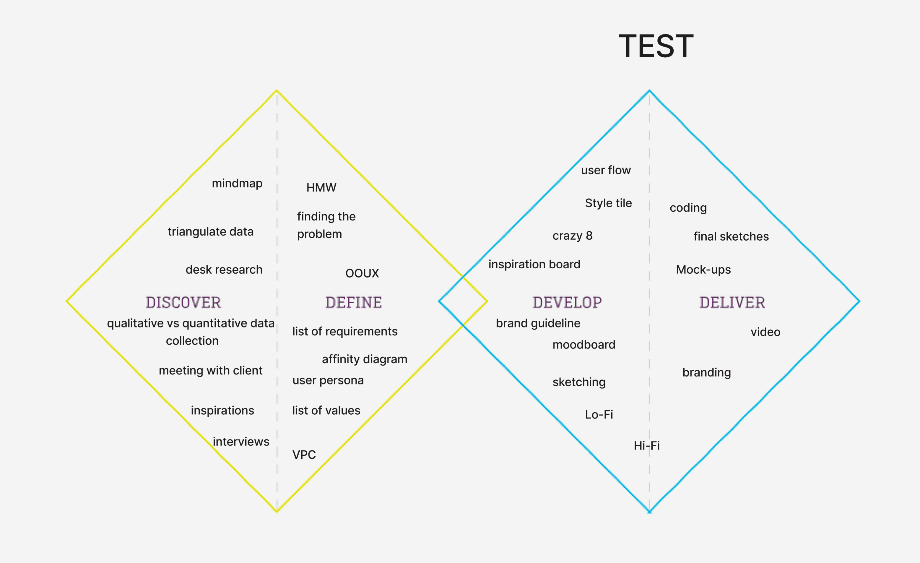
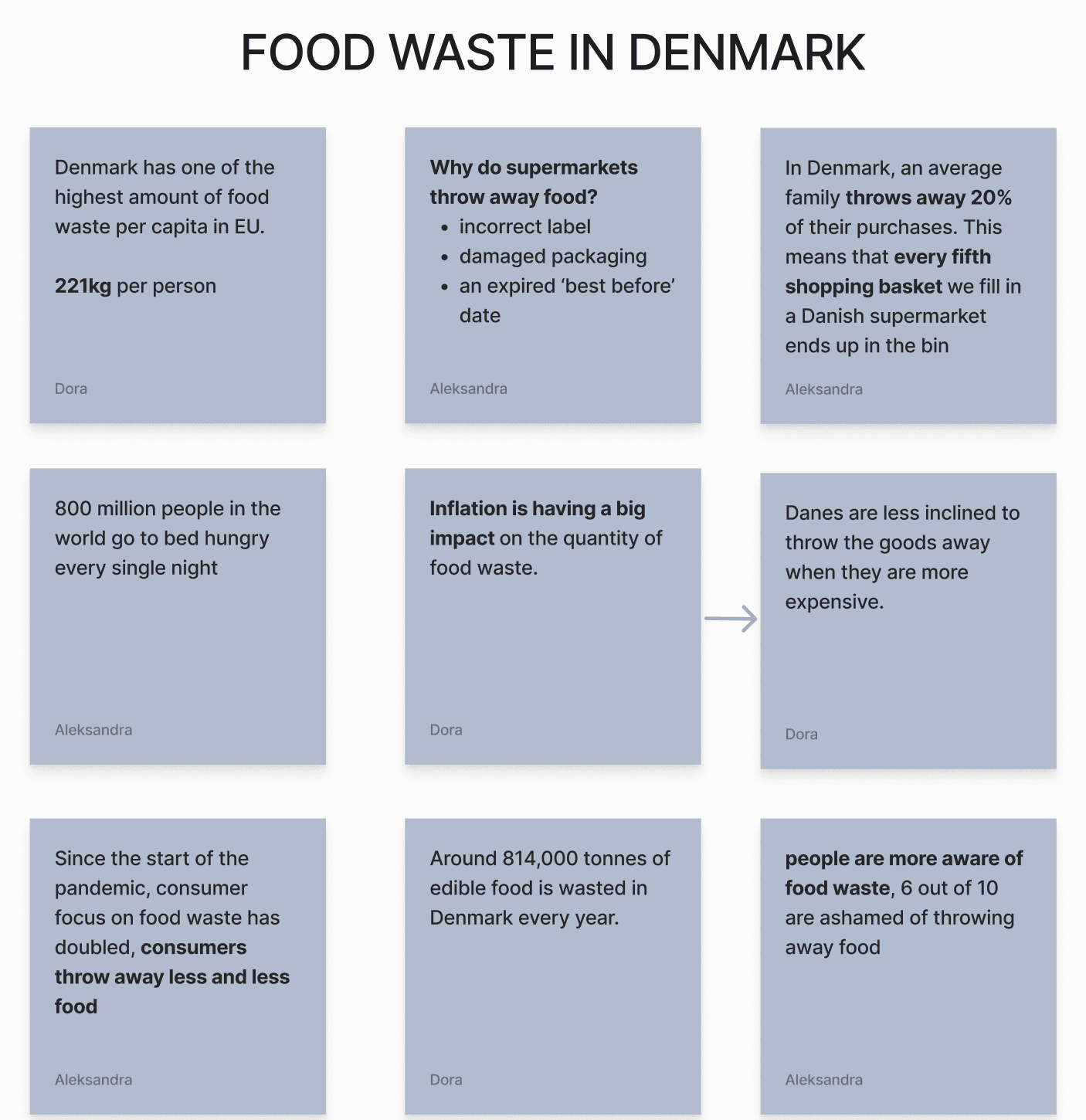
We used the Double Diamond method to guide our research through four stages: discover, define, develop, and deliver. In the DISCOVER phase, we researched food waste in Denmark using reports, studies, and interviews with stakeholders to understand behaviors. During the DEFINE phase, we analyzed the data to identify key problems, created user personas, and established project requirements based on trends and patterns in food waste.
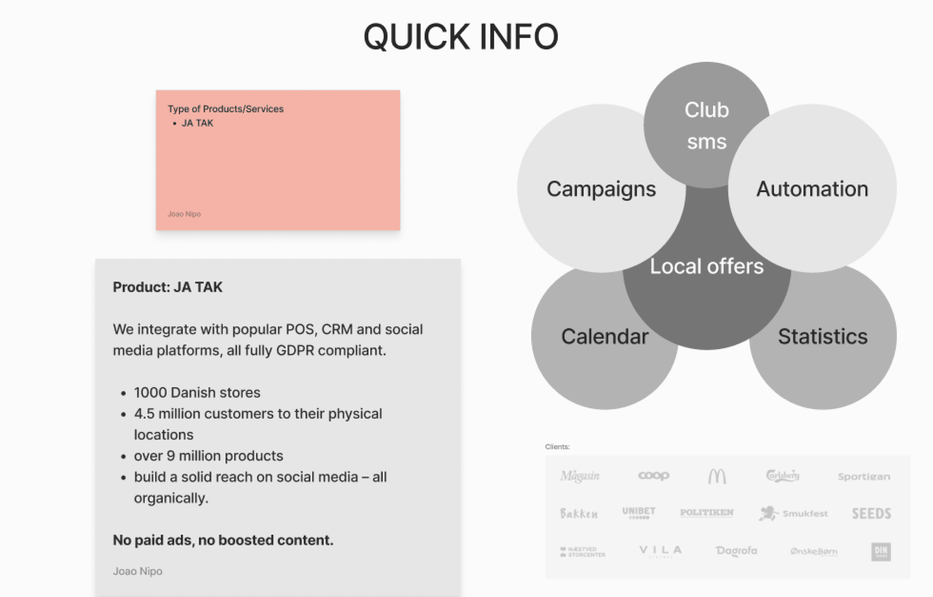
We divided the research tasks within our team, focusing on different aspects of the project. We first explored Quick Info, understanding their mobile marketing services, particularly their “Ja tak” subscription system, which allows customers to order via social media comments, simplifying the process.
Desk research
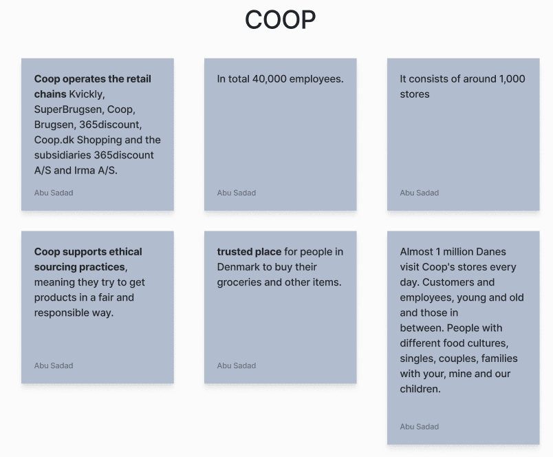
Next, we gathered data on Coop, their values, and their impact on Danish consumers, which helped shape our approach. We also researched food waste in Denmark and the changing public attitude towards waste reduction
Identifying stock and inventory managers as our primary target group, we brainstormed stock management solutions, as few examples were available online. We also explored how integrating databases could automate tracking expiration dates, improving efficiency and stock management.
Finally, we refined our interview questions, narrowing them down to eight key ones to gather the most relevant information for our solution.
After completing our desk research, we moved on to field research, engaging with employees at Coop stores, specifically Kvickly and Coop 365 Discount. To guide our conversations, we created an interview guide focused on how they manage food waste and track expiring products.
Insights from these interviews revealed that staff manually check expiration dates each morning using a device, marking soon-to-expire items with yellow discount stickers. Our research indicated that increasing automation could improve stock management efficiency.
A significant finding was the staff's aversion to reservation systems for retrieving near-expiration food. They preferred a "first-come, first-served" model, as reservations often lead to unclaimed items and added to their already busy workload.
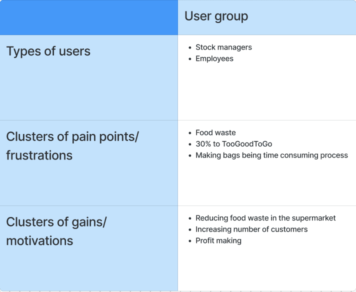
We created an affinity diagram to organize insights from our brainstorming. It highlights two user groups: stock managers and employees, each with unique needs. Key pain points included food waste, profit loss to TooGoodToGo, and the time-consuming creation of mystery bags.
Gains identified were reducing food waste, attracting more customers, and increasing profits. Addressing these issues can enhance operations and boost profitability for supermarkets.
Similar solutions
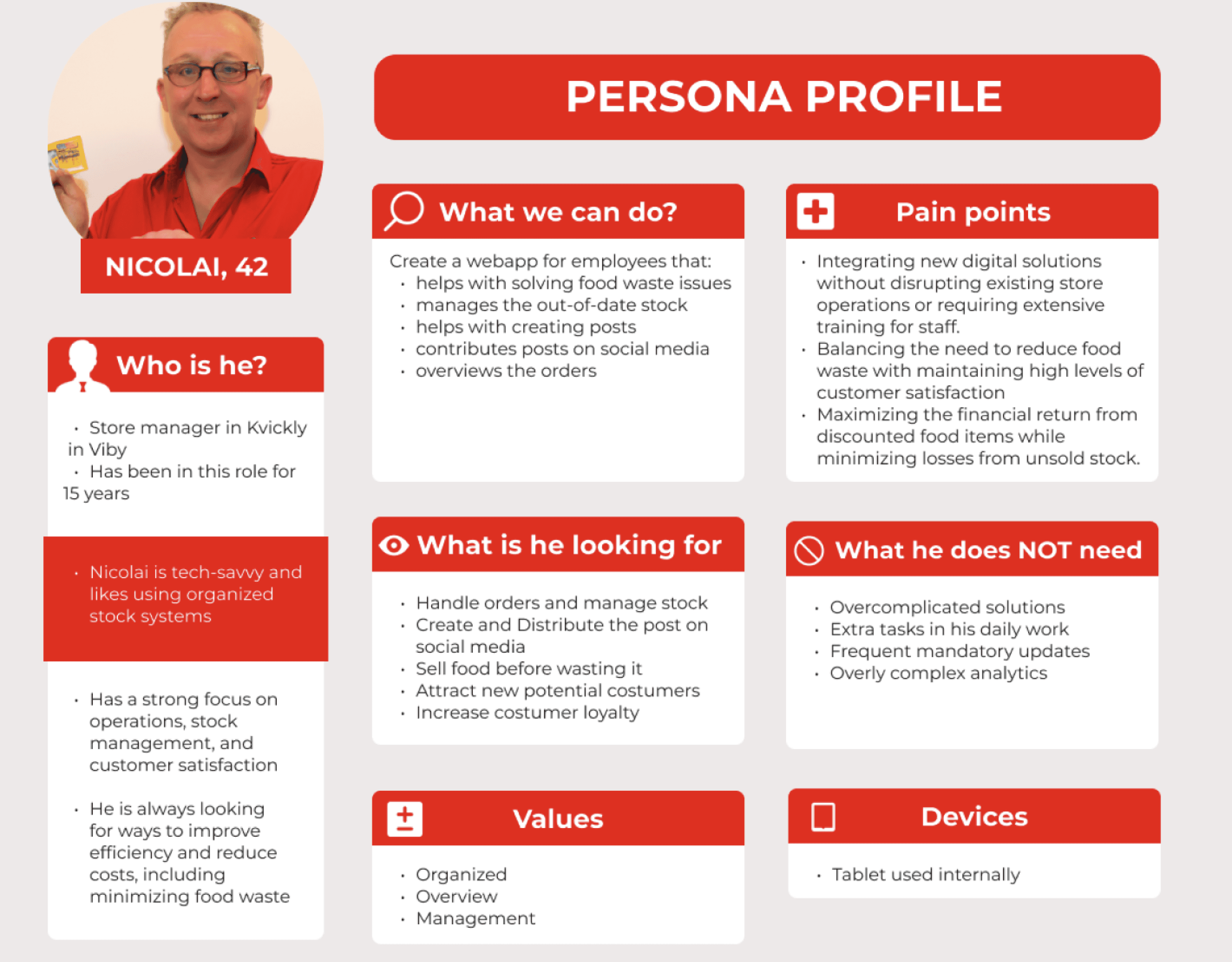
Based on the affinity diagram and our observations, we developed a persona named Nicolai, a seasoned store manager at Kvickly.
He oversees product shelf life, aiming to enhance customer satisfaction while minimizing food waste and maximizing profits from discounted items. Nicolai’s challenges include adopting new digital solutions without disrupting operations or requiring extensive staff training.
Understanding Nicolai's needs helps us create an effective solution tailored to managers like him.
Findings
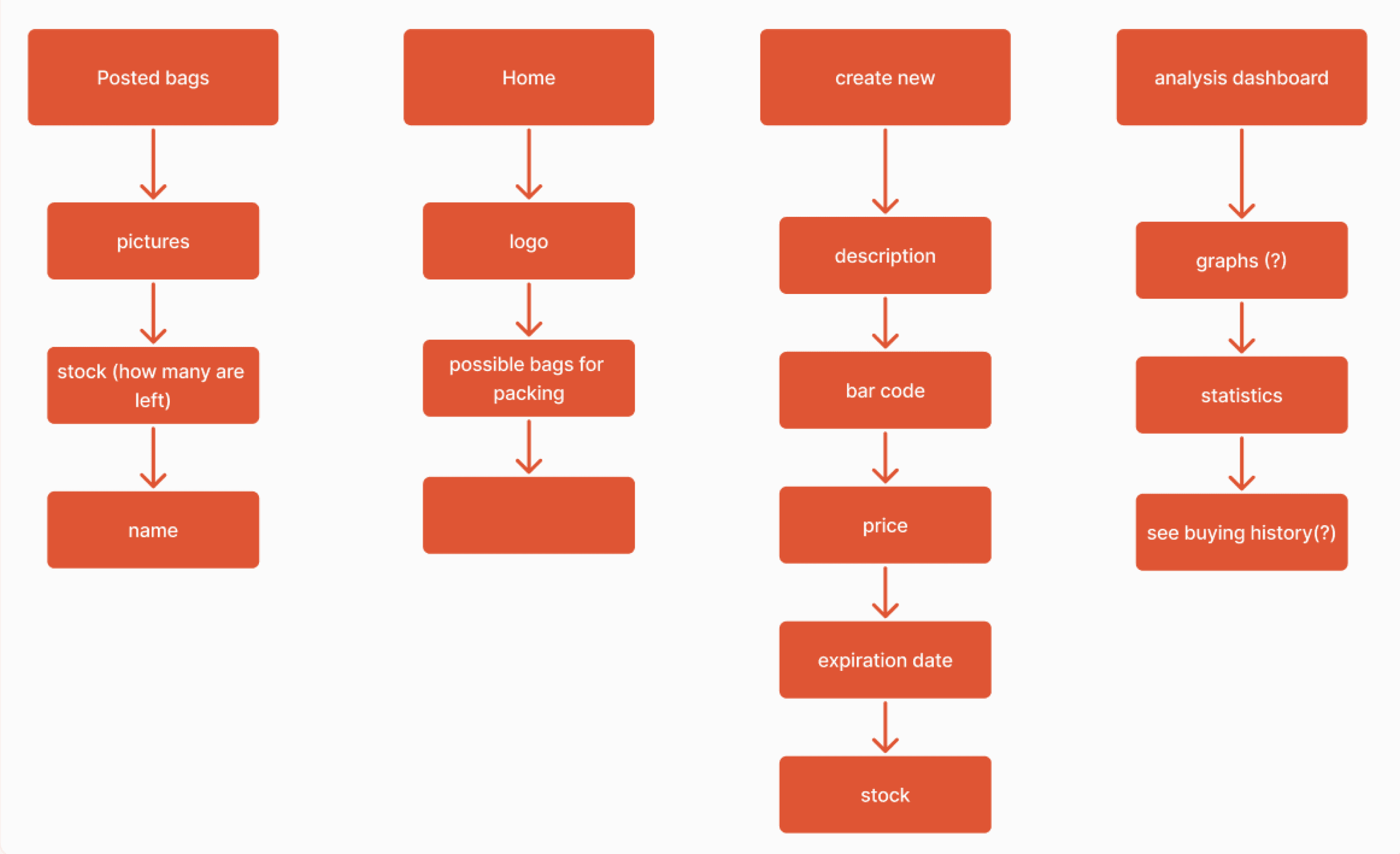
We developed an OOUX framework to clarify the user experience hierarchy. This framework focuses on pathways, actions, and user objects, allowing us to refine our design around user needs. Our key subcategories include Posted Bags, Home, Create New, and the Analysis Dashboard, ensuring alignment with project objectives and requirements.
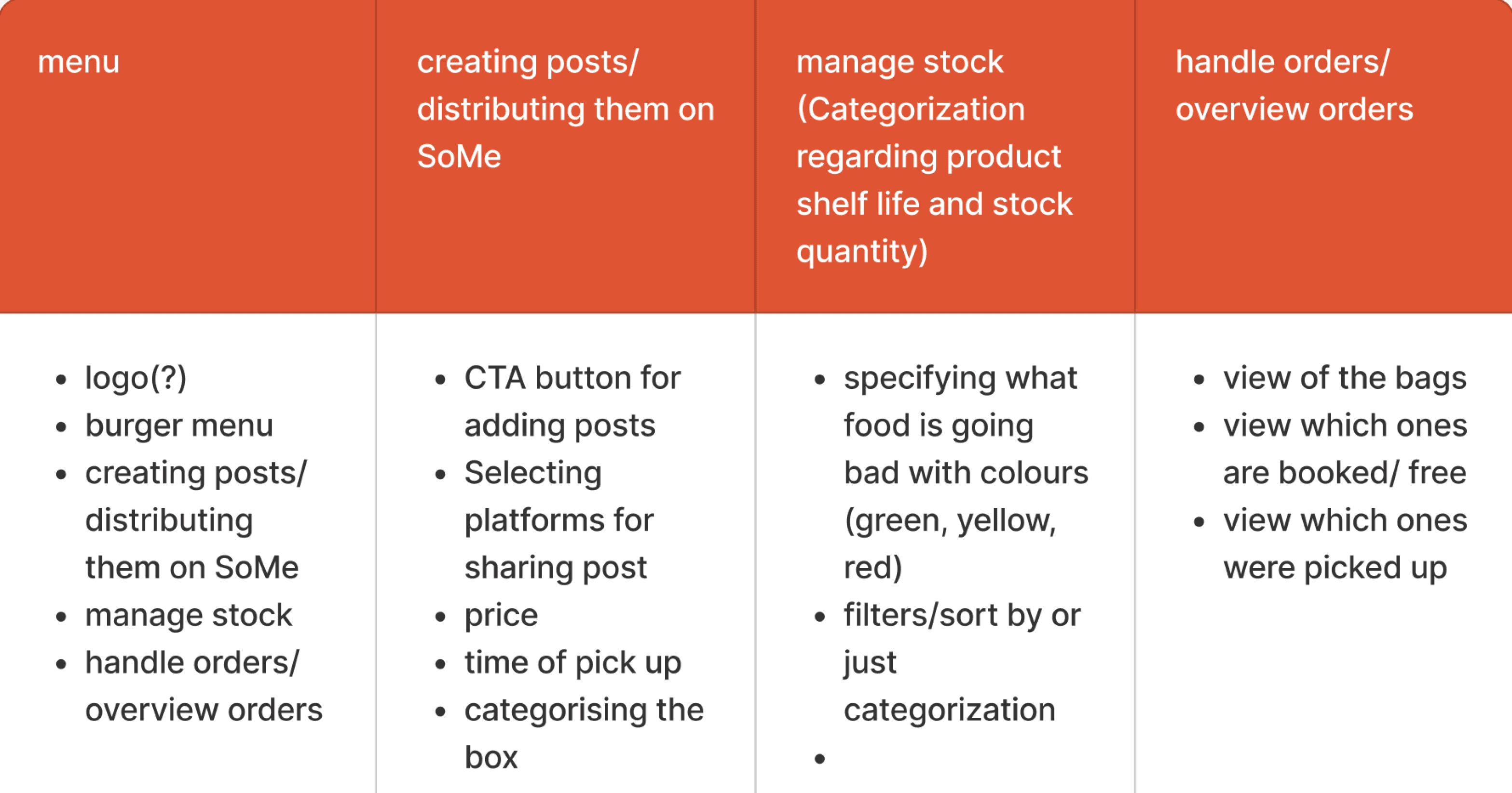
For the requirements list, we organized key categories for our solution’s main pages.
Menu: We included a logo for brand recognition and a burger menu for easy navigation. We also designed a feature for employees to quickly post about available bags.
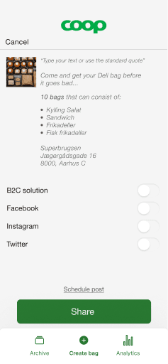
Creating Posts: This section allows for categorizing products to streamline bag management. Essentials like pricing, pickup times, social media sharing, and call-to-action buttons are included.
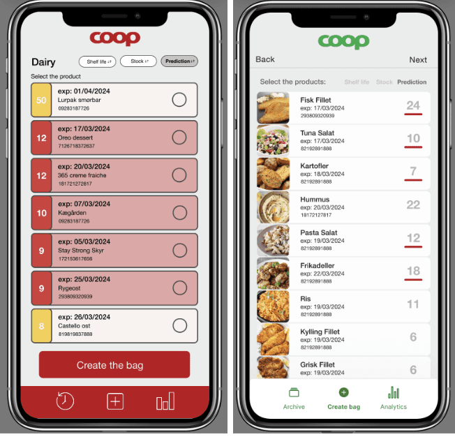
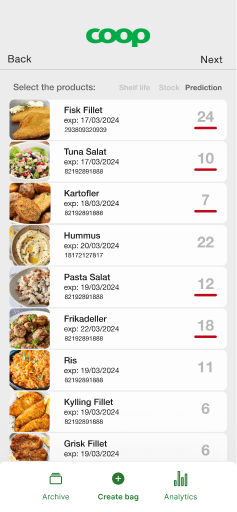
Managing Stock: We proposed using color-coded icons to represent food expiration and a filter option for quicker item searches.
Handling Orders: This category includes overviews of orders, tracking which are booked, picked up, or still available.
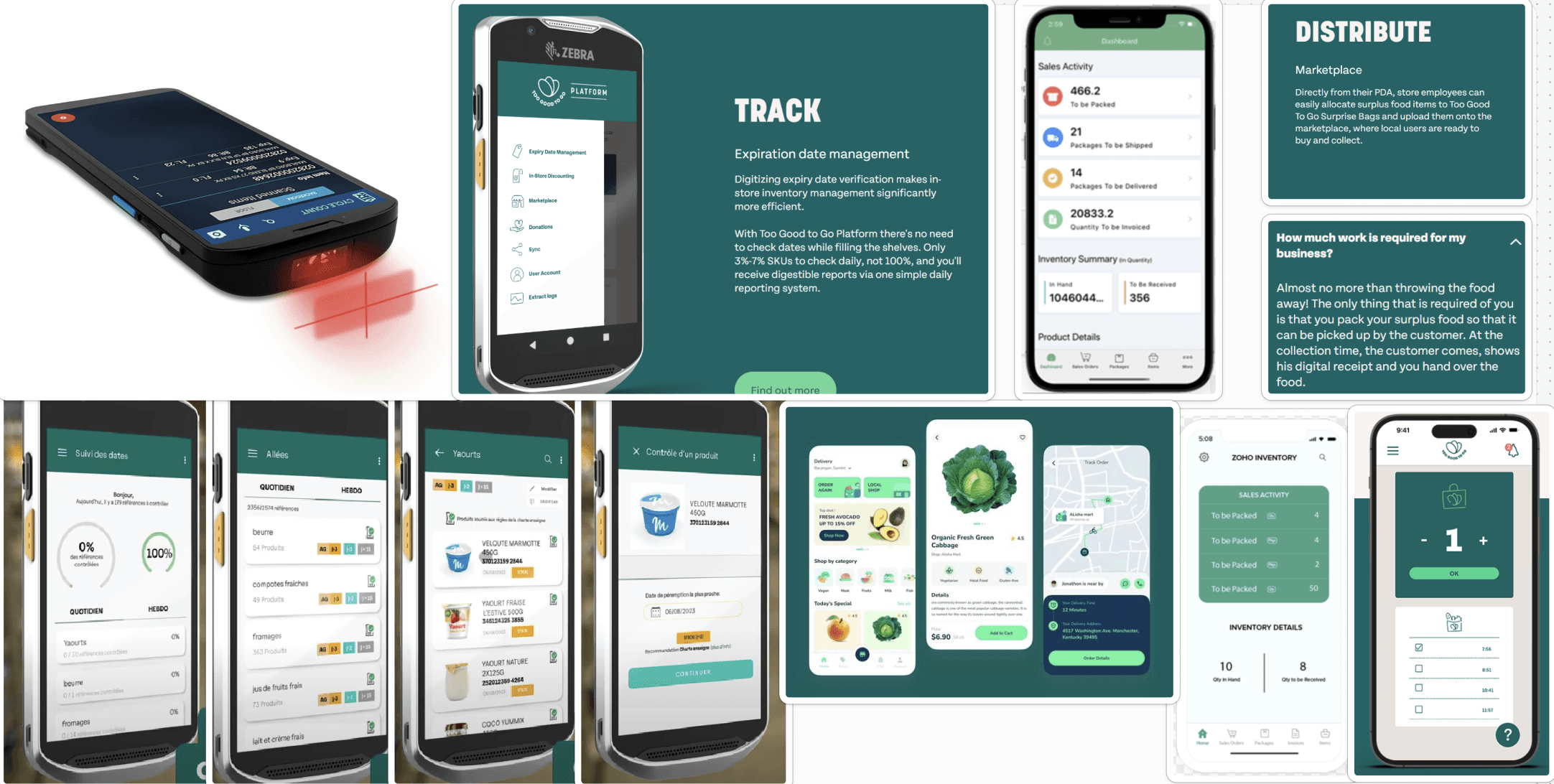
Next, we created an inspiration board to gather design elements and references for our solution. This board helped us explore various digital features, primarily drawing inspiration from the "Too Good To Go" platform, as there were few similar web apps available for reference.
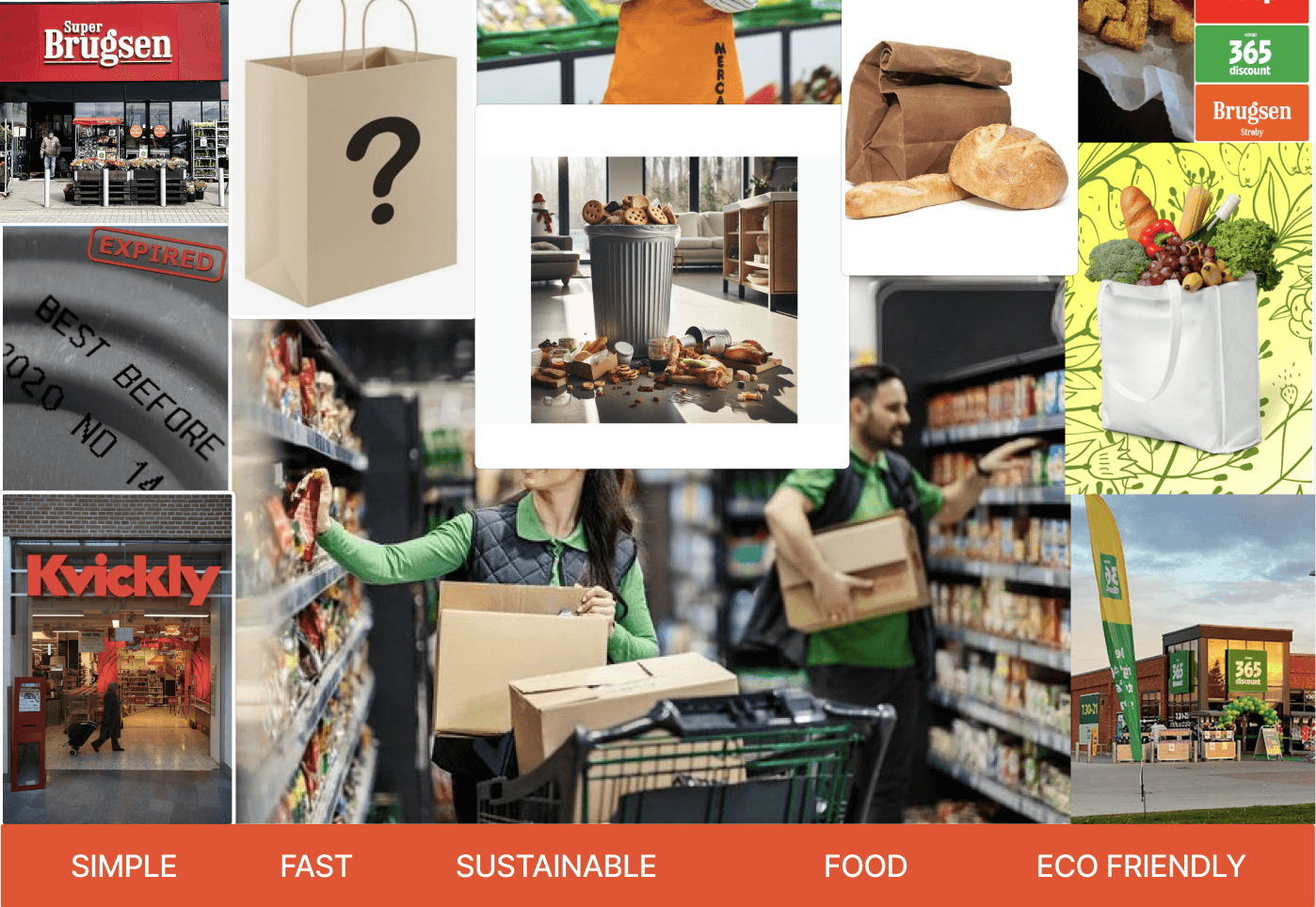
We then created our moodboard, featuring Coop's signature red to align with the brand. It includes images of employees stocking shelves to emphasize the app's users, while mystery bags are highlighted to showcase our focus on providing surprise deals on soon-to-expire food. Key words like "simple," "fast," "sustainable," "food," and "eco-friendly" anchor our design goals, ensuring the app remains user-friendly, efficient, and environmentally conscious.
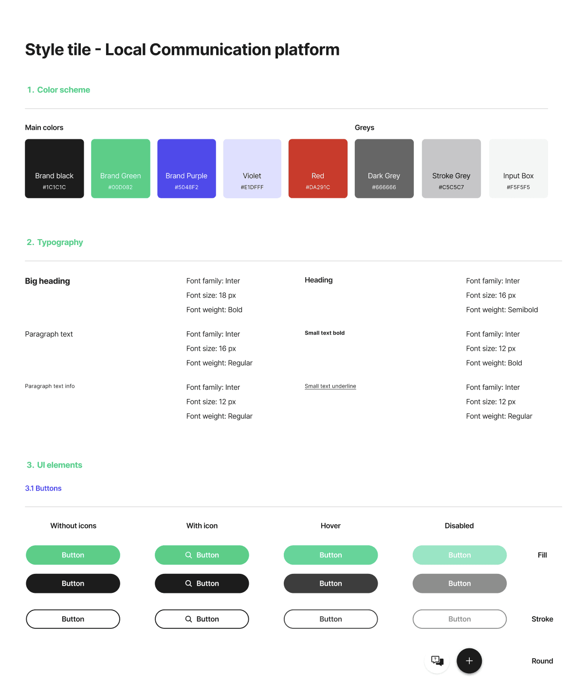
The style tile showcases our solution's visual elements, aligning closely with Coop's branding while emphasizing sustainability. We prominently feature two shades of green—one matching Coop's logo and the other from the Quick Info project—as well as the signature red.
For typography, we chose Helvetica Neue for its strong readability and solid appearance, which meets our usability needs. The UI elements are designed for clarity, with rounded button corners for approachability, while maintaining a professional look.
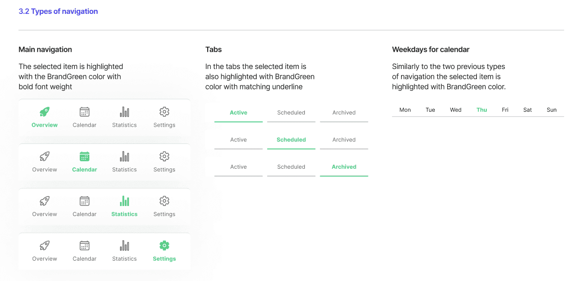
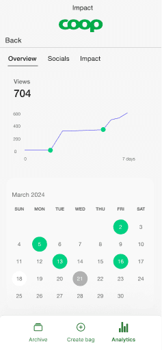
Navigation and tabs utilize the brand's green, switching from outlined to filled when active, with active titles appearing in bold. The calendar features four statuses—Inactive, Current Day, Posted, and To Post—each color-coded for quick comprehension. Iconography consists solely of symbols from the client’s style guide, ensuring consistency throughout.

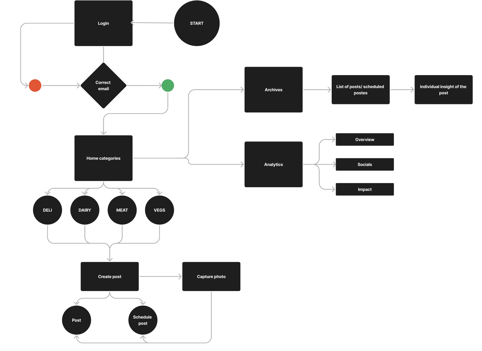
We initiated the user flow development by referencing our previously established requirements list. This flow outlines the steps users take to complete specific tasks, guiding us in visualizing the app's layout.
A well-designed user flow is essential for an optimal user experience (UX), ensuring that users can achieve their goals efficiently and with minimal frustration.
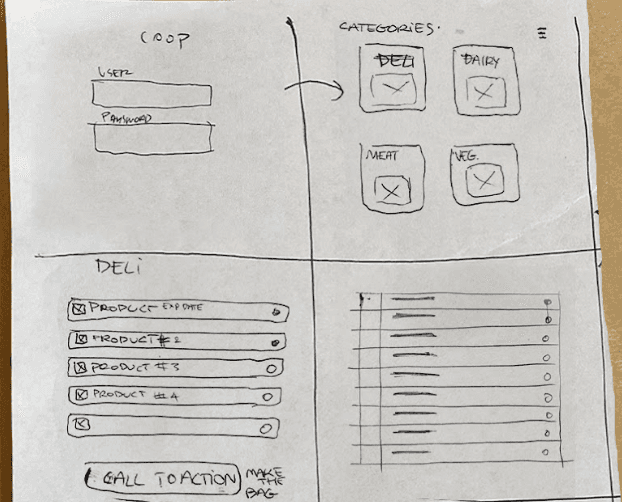
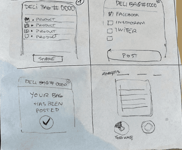
The "Crazy 8" approach allowed us to generate numerous quick sketches in a limited timeframe, facilitating the exploration of diverse ideas for our project. By visualizing our concepts, we were able to identify the strongest sketches, which became the foundation of our solution. The primary "Crazy 8" sketch highlights the most promising ideas we developed during this phase.
After the Crazy 8, we engaged in a class exercise where each team member sketched their vision for the solution. This collaborative effort allowed us to discuss and evaluate the best ideas.
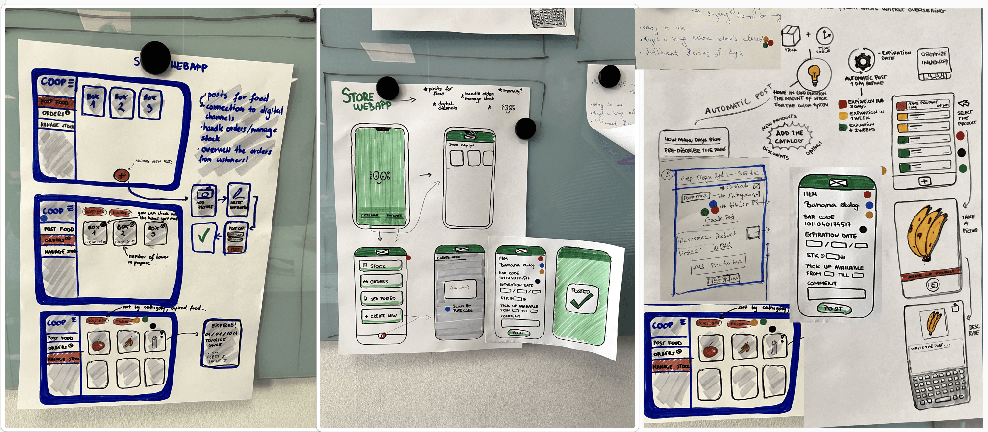
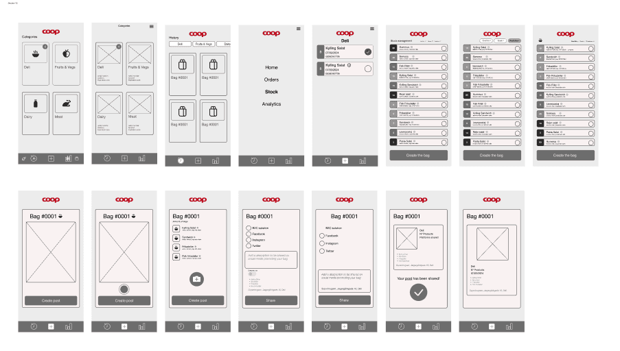
We transitioned our ideas from sketches to Lo-Fi prototypes using Figma, gradually shaping a comprehensive solution. Focusing on our user persona, we designed a sensible interface that meets user needs. Our wireframes emphasized stock automation for bag creation, and we thoughtfully integrated each team member's suggestions, resulting in a well-rounded response.
After completing our Lo-Fi prototype, we tested it using the Thinking Aloud method, gathering extensive feedback. Testers expressed confusion over color organization, product details on the stock page, and the absence of an organization page for reserved bags, leading us to make necessary updates.
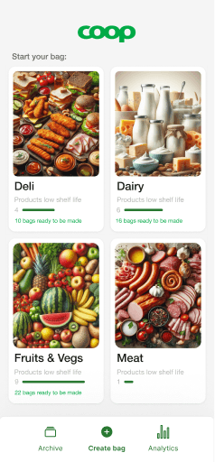
We revised the product page by limiting the color scheme to red for items nearing expiration (1-3 days) to enhance clarity. Additionally, we relocated product descriptions to prioritize expiration dates during bag creation. To streamline the process, we introduced pre-written descriptions for each category, allowing users to customize details efficiently.
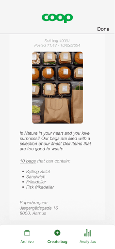
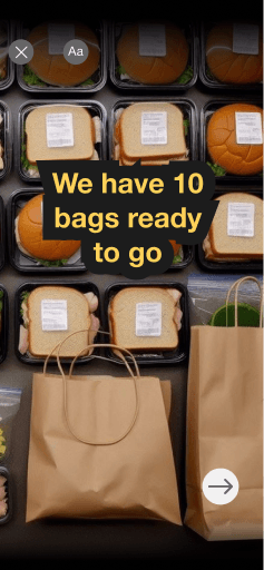
Recognizing the importance of time management, we added a post scheduling feature for greater effectiveness. We also enhanced the history page by including detailed descriptions and timestamps for each bag, clarifying which bags have been picked up and which are pending collection. This change aims to improve efficiency for staff members.
After completing our Hi-Fi prototype, we conducted testing sessions to evaluate its performance, again utilizing the Thinking Aloud Method. Over five sessions, we received mostly positive feedback on the overall structure, along with some valuable suggestions for improvement.
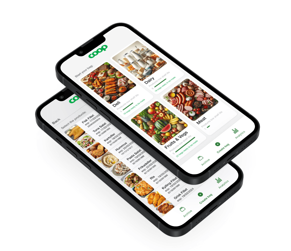
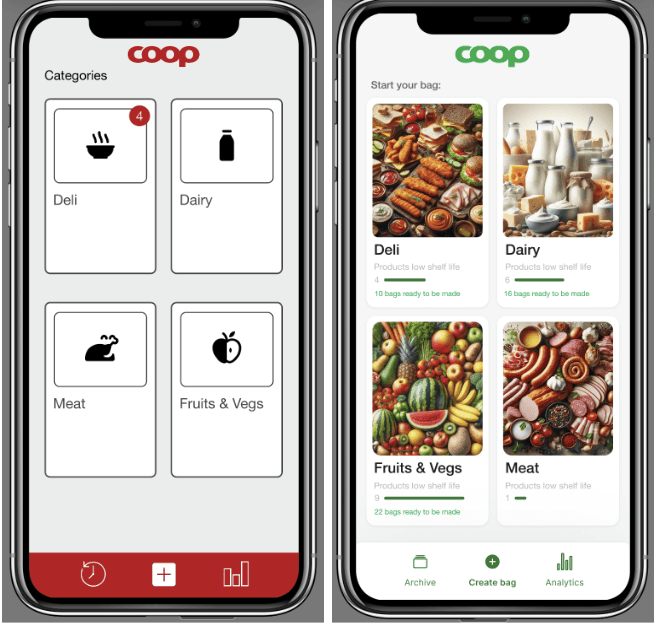
One tester recommended replacing icons with pictures for better readability, which we implemented. Another noted confusion with wayfinding, prompting us to add guidance on every page. We also changed "Categories" to "Start your bag" for clarity.
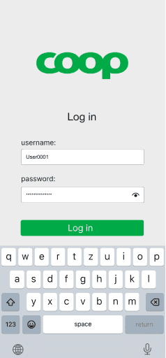
Our HiFi Prototype revolutionizes grocery management by integrating advanced design principles with cutting-edge technology to create a user-friendly, efficient, and effective tool tailored for B2B clients in the grocery industry.
Media
To conclude our testing, we performed a Gangster test, which yielded positive insights, indicating promising usability for our solution.
We maintained design consistency across the website, applying the law of proximity on the City page as well. Filters for music type and days of the week were added to help users quickly find parties.
Conclusion
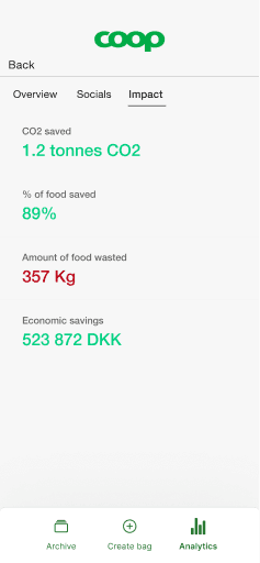
In essence, our solution aligns with the goal of reducing waste by making nearly-expired products available before they’re discarded.
We've created a straightforward system for Coop to tackle food waste in Danish supermarkets. By offering mystery bags filled with soon-to-expire items from key categories — fruits and vegetables, meat, dairy, and deli — we provide a long-term solution that benefits both the business and the community.
Designed with store managers in mind, our system leverages their expertise to efficiently manage the program while supporting Coop’s sustainability efforts.
