Group members
Through client interviews and desk research, we identified our target audience as young adults, both locals and tourists, seeking a seamless clubbing experience. We learned that music preferences, simplicity, and engagement are key factors for club-goers, and clubs attract customers through strong branding and digital strategies. Recognizing language barriers, we decided to offer both English and Italian versions of the platform. Insights from competitors and clubs like Murreto in Rome also helped shape our booking and cancellation policies.
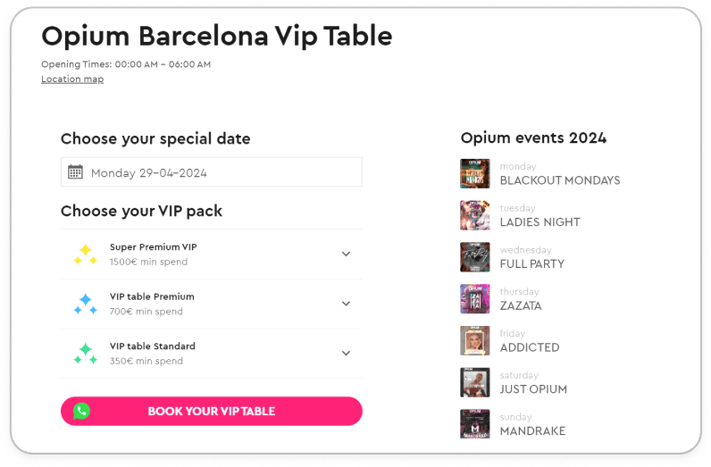
Our client, Pier, is an Italian startup focused on solving a major issue in the country's nightclub scene: the fragmented and inefficient table booking process. Currently, booking a table at nightclubs in Italy is complicated, with no unified system in place. Users often face confusing, outdated processes, including phone reservations that can create language barriers, especially for tourists. This lack of simplification not only frustrates users but also limits nightclubs' ability to streamline operations. By solving these challenges, Pier aims to become a market leader in Italy's nightlife industry, with plans for international expansion.
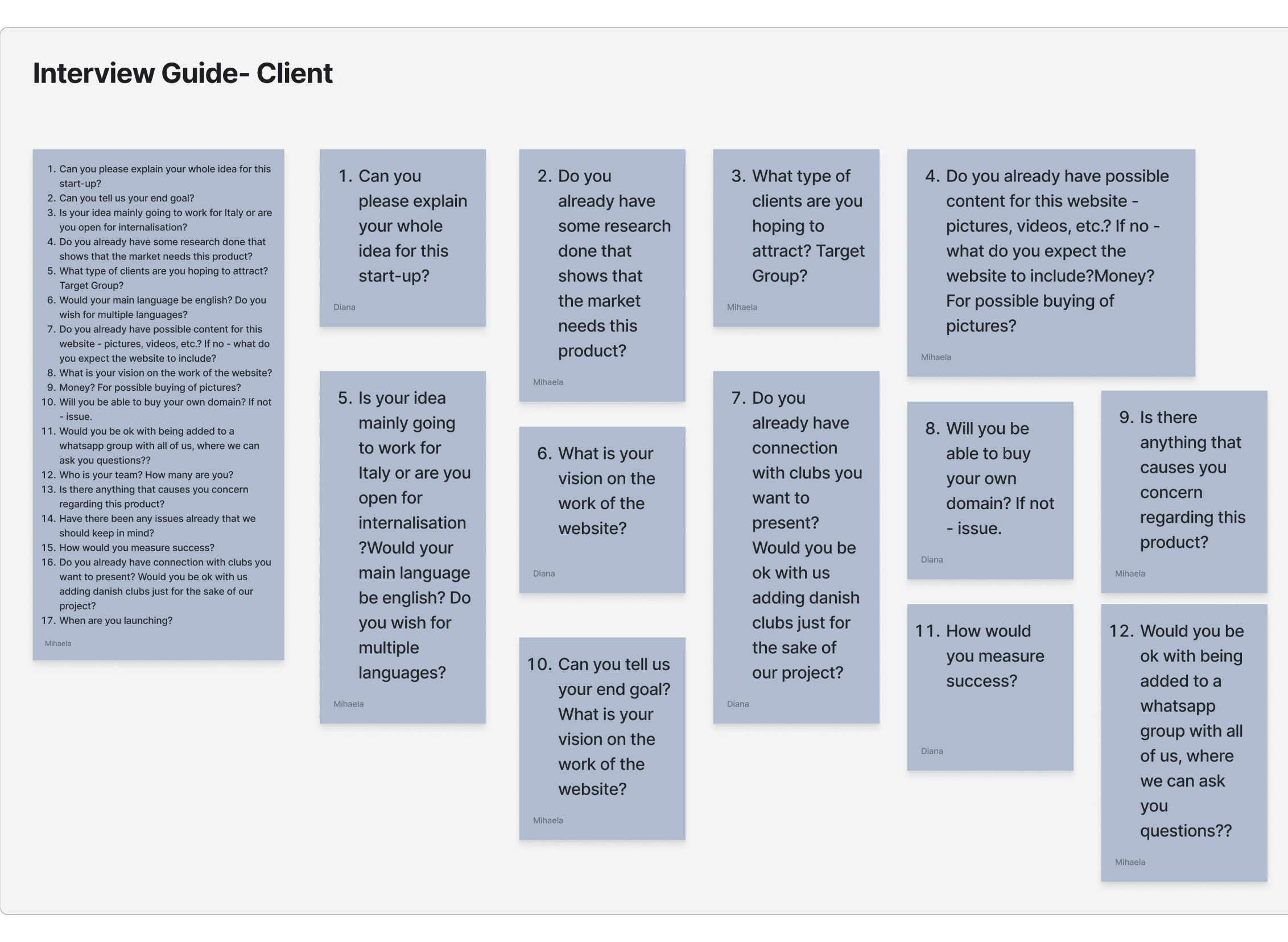
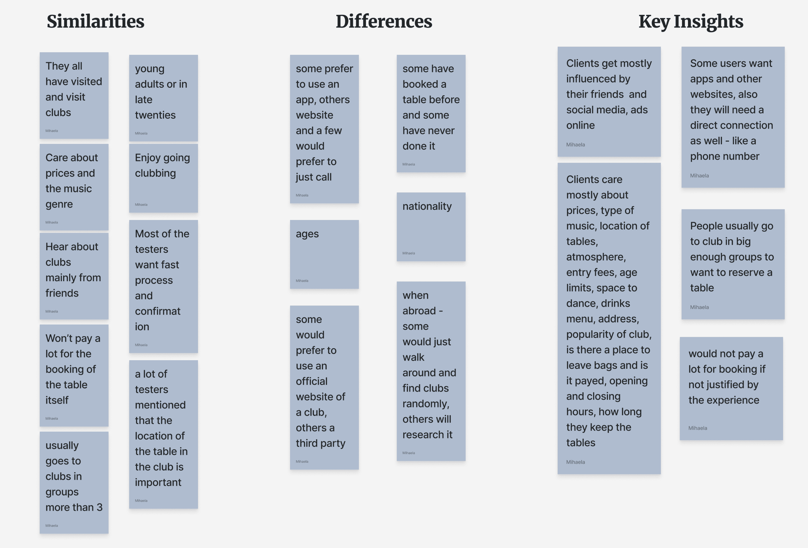
Our research approach centered on user interviews to gain insights into the preferences and challenges of our target audience. We conducted interviews with 11 individuals, mainly young adults from Italy, to validate our assumptions and refine the nightclub booking website design. We asked 14 key questions focused on user needs, booking habits, preferred features, and willingness to pay. This helped us gather valuable feedback to shape the final design.
From the interviews, we gained key insights into user habits and preferences
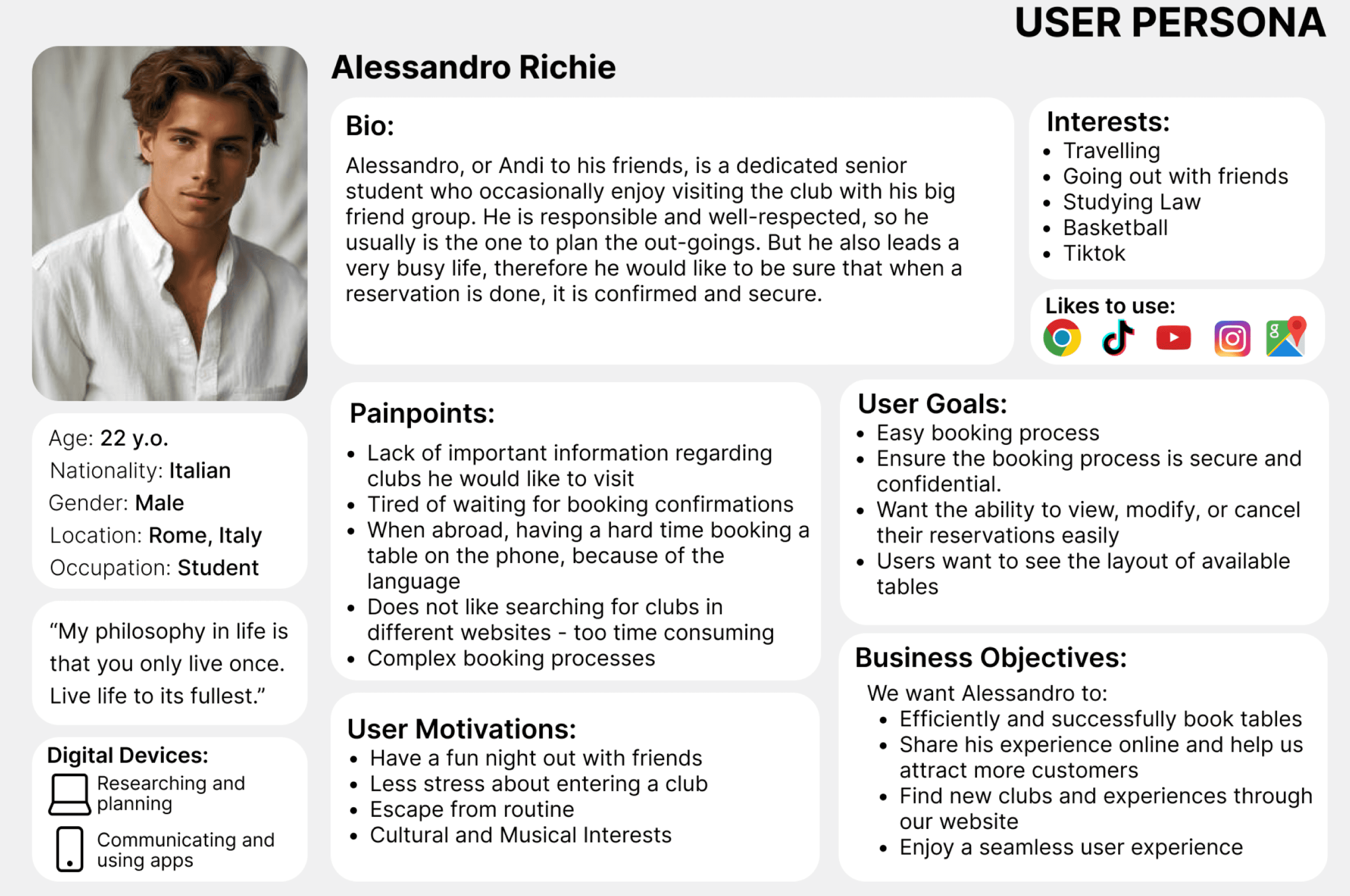
Persona
Using demographic data and our Affinity Diagram, we created a user persona, Alessandro, a 22-year-old Italian law student. His pain points include difficulty finding well-structured club information and challenges with booking tables abroad due to language barriers. We used these insights to design a solution that addresses his needs for a simple, secure booking system with easy reservation management.
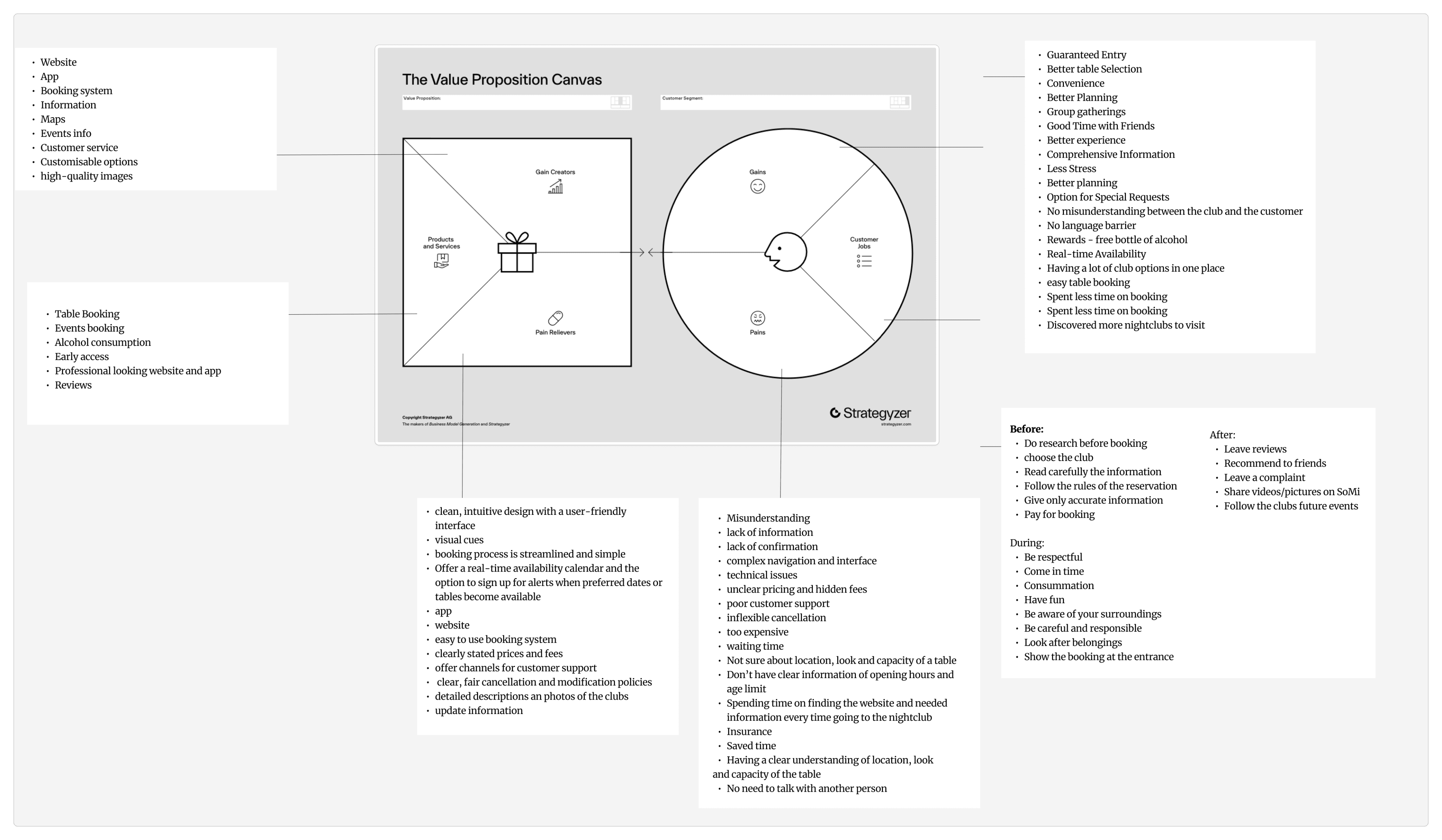
By analyzing Alessandro’s pain points and desires, we used The Value Proposition Canvas to identify user gains, jobs, and pains. This helped us develop targeted solutions, including gain creators, products, services, and pain relievers, ensuring our product effectively meets user needs and expectations within the industry and market context.
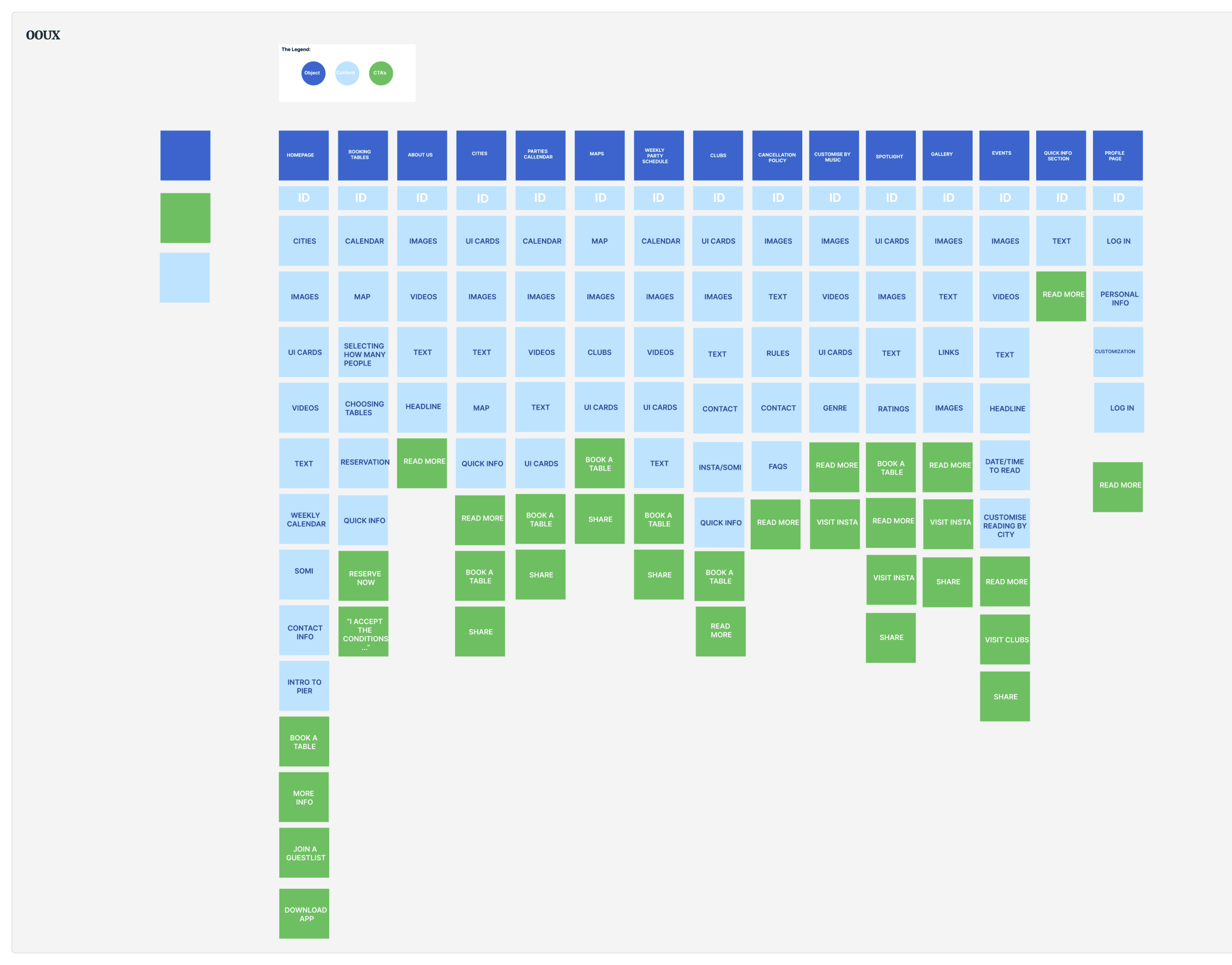
After completing the Value Proposition Canvas, we created the OOUX framework to organize key content. Dividing elements into objects, content, and CTAs helped balance information and interaction on each page. This ensured our design aligned with project goals and enhanced the user experience, especially prioritizing Alessandro’s needs for a more intuitive, user-friendly website.
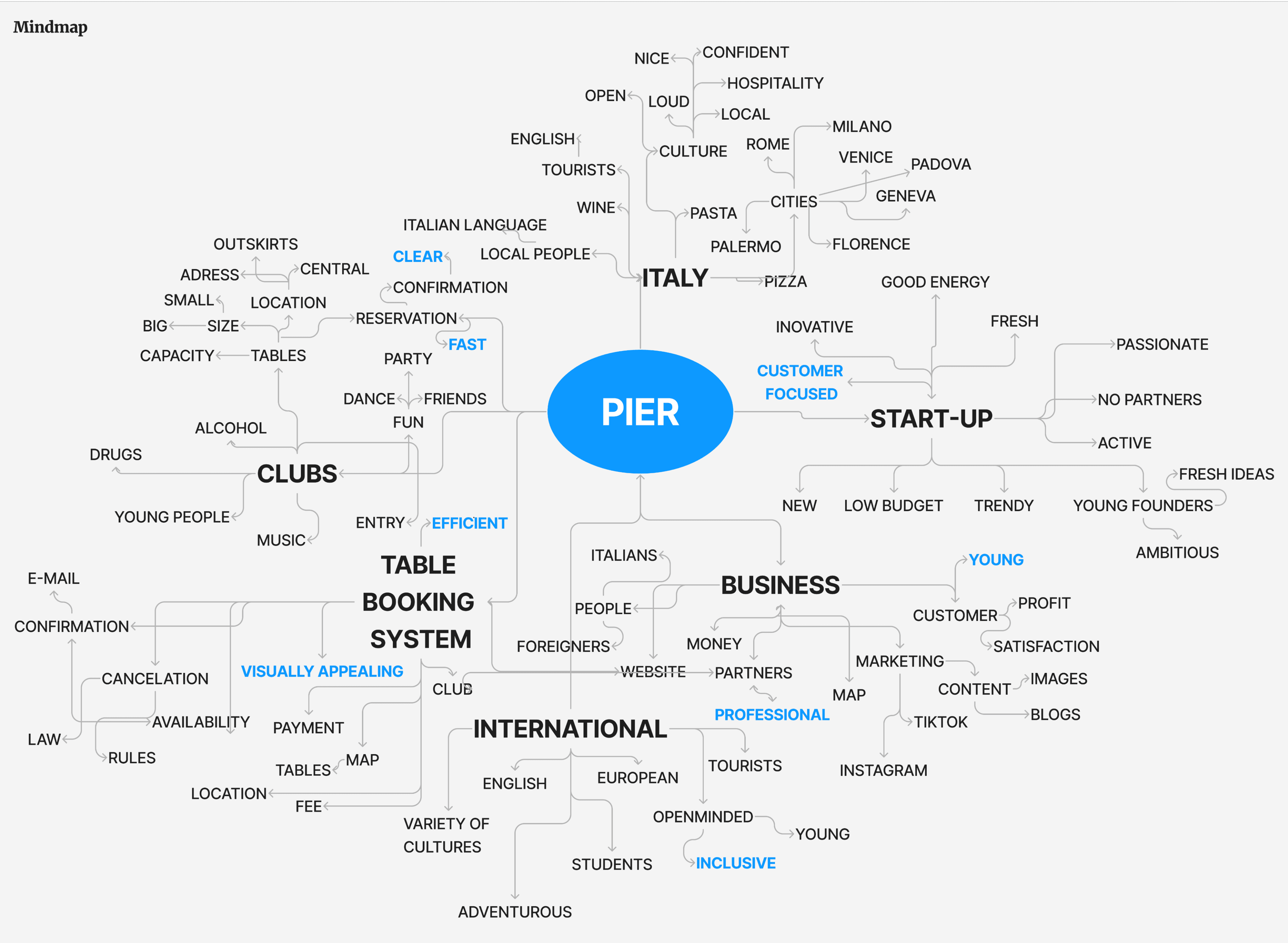
To start the design process we created a mind map to visually organize and structure information, helping us identify key connections and logical flows in the design. This guided our decisions while revamping the website.
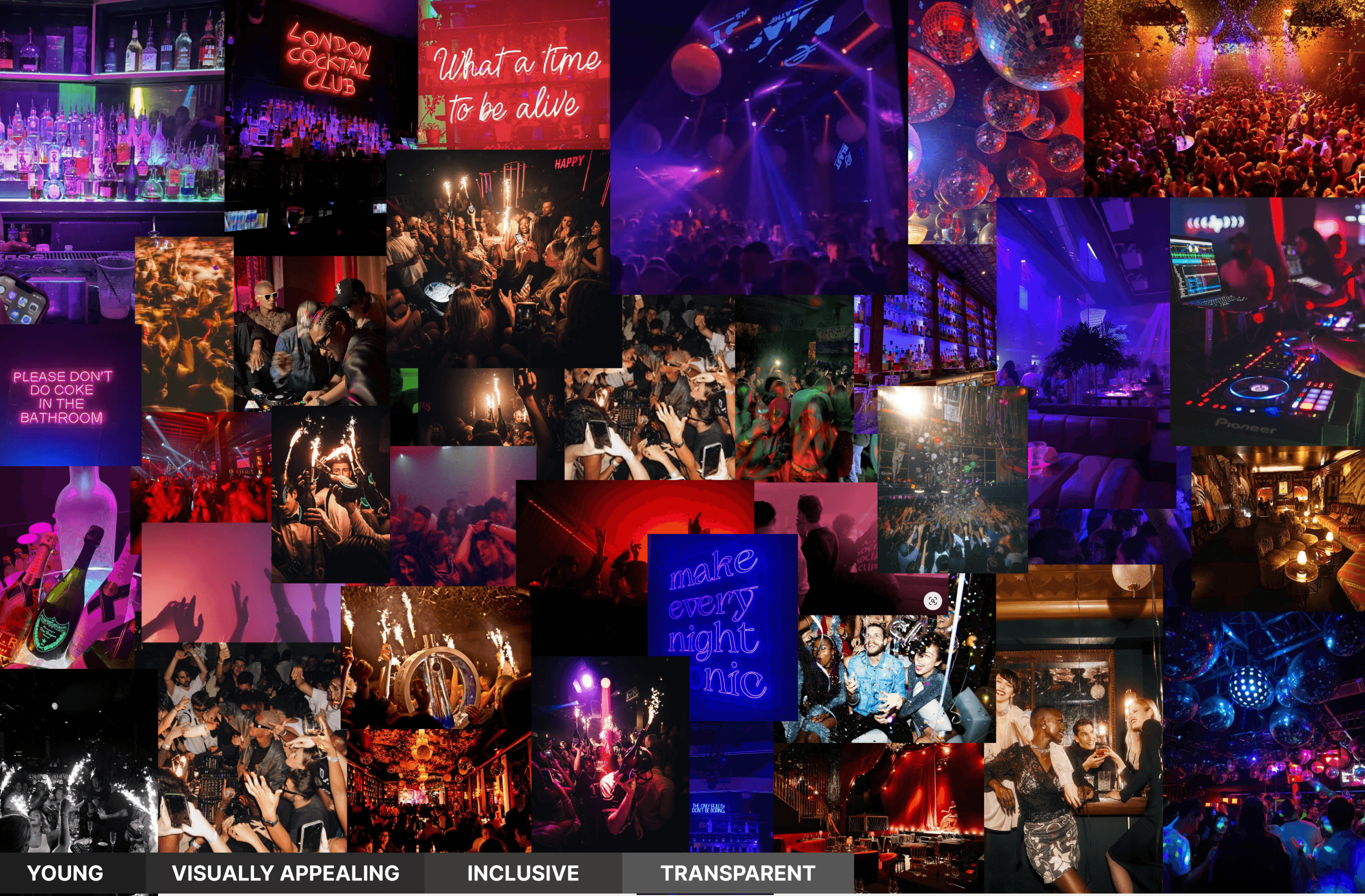
After gathering inspiration, we created a moodboard filled with vibrant club scenes to capture the dynamic nightlife atmosphere we want to promote with our booking service. We focused on key values: "Youthful" to appeal to young adults, "Visually Appealing" for both functionality and aesthetics, "Inclusive" to welcome diverse users, and "Transparent" to ensure honesty and a seamless user experience. These values guide the tone and design of our website.
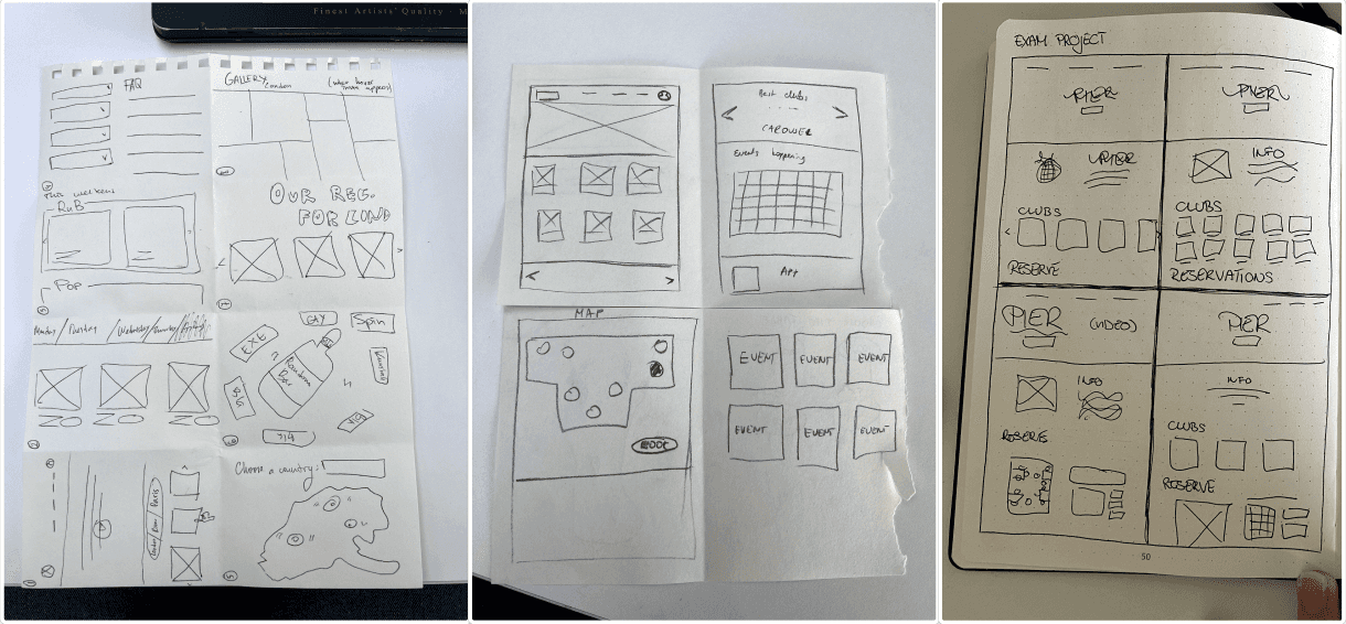
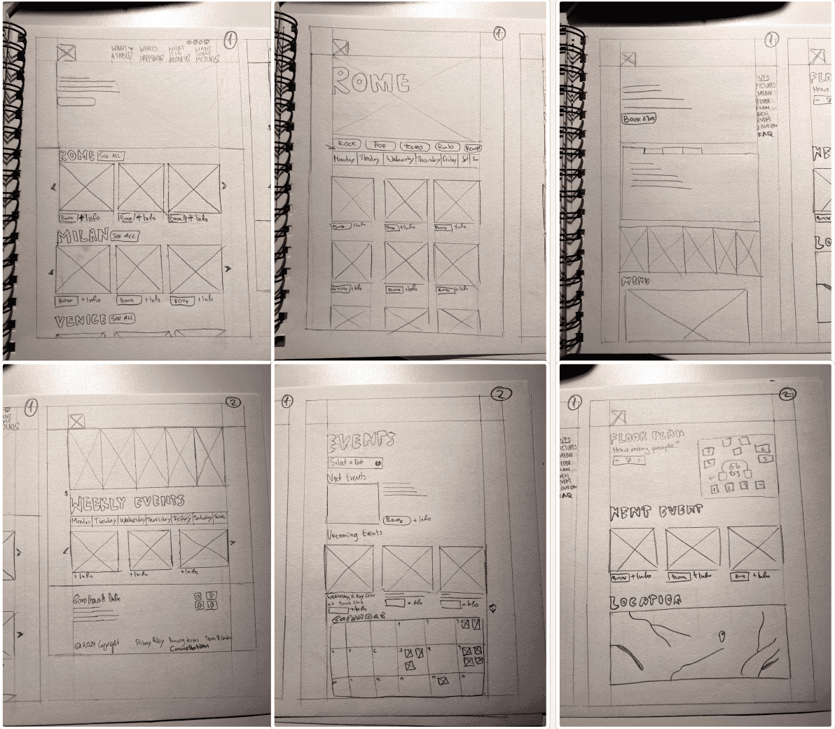
After gathering ideas, we used the Crazy 8 method to quickly sketch multiple concepts, allowing us to explore various design options. Key elements for the final design included a video background on the homepage for a dynamic look and a "Book a Table" section featuring a club floor plan, calendar, and filters for easy navigation.
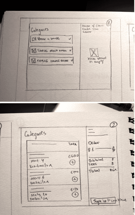
After discussions, brainstorming, and using our Crazy 8 sketches, we created the final sketch. We incorporated key components like customization, CTA buttons, and accessibility, all while focusing on Alessandro's satisfaction and smooth navigation. These sketches served as a crucial guide for the entire design process.
With our ideas on paper, we moved on to creating the User Flow. This flow diagram ensures that Alessandro can navigate the website intuitively, enhancing usability and satisfaction. It focuses on the main goal: discovering a club and booking a table. The process starts with selecting preferences—like city and club—and concludes with a confirmation email.
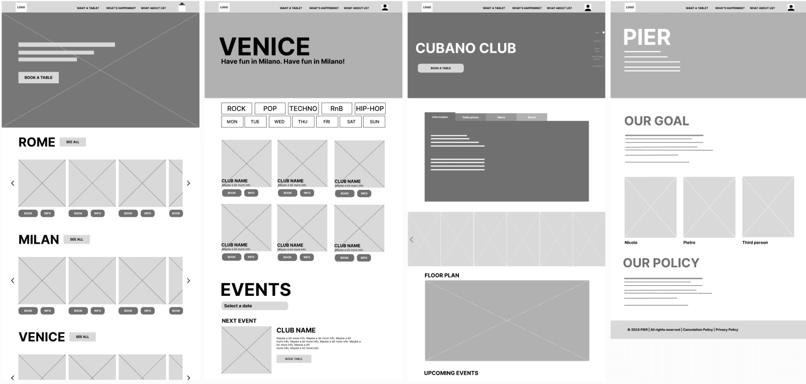
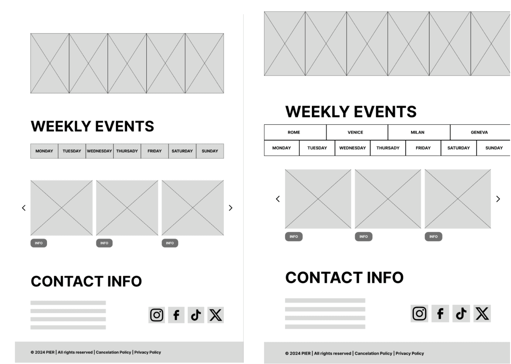
Using our mappings and sketches, we created low-fidelity prototypes in Figma, enhancing usability for later testing. Our front page design mirrors earlier sketches, incorporating the Law of Proximity and Miller's Law with carousels showcasing a few clubs. We followed Jacob’s Law to keep Alessandro's experience intuitive.
For Club Pages, we included essential information from our interviews, such as location, menu, events, floor plans, and a photo gallery, guided by our Information Architecture. The About Us page addresses common policy questions. We also designed a pop-up booking form for added functionality.
For our lo-fi testing, we employed the Think Aloud Method. Seven testers were asked to verbalize their thoughts, actions, and feelings while completing tasks. This provided valuable insights into their user experience. Detailed responses can be found in the testing documentation.
We received extensive feedback from our testers and used their insights to make design changes, including renaming navigation buttons for clearer usability.
At this stage, we created our Design Manual, which provides guidelines for visual elements, interactions, and user experience, ensuring a cohesive look throughout the website.
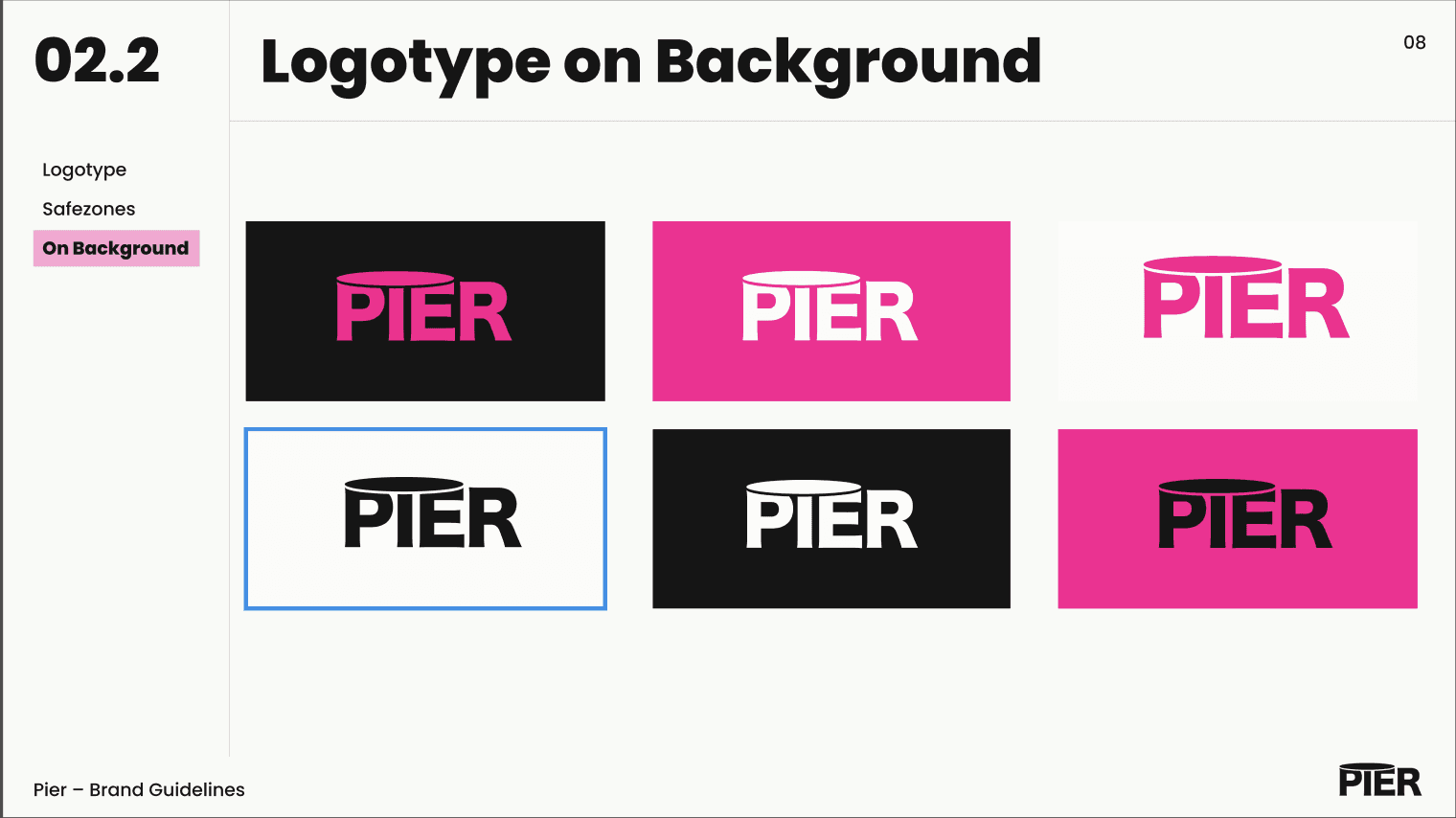
Our logo features the “Hiragino Sans” font for a clean, modern design. The stylized "i" in "Pier" represents a table, creatively integrating above the "P" and "R" to symbolize our service of connecting users with nightclub table bookings.
We showcased the logo with various color combinations of our primary and secondary colors.
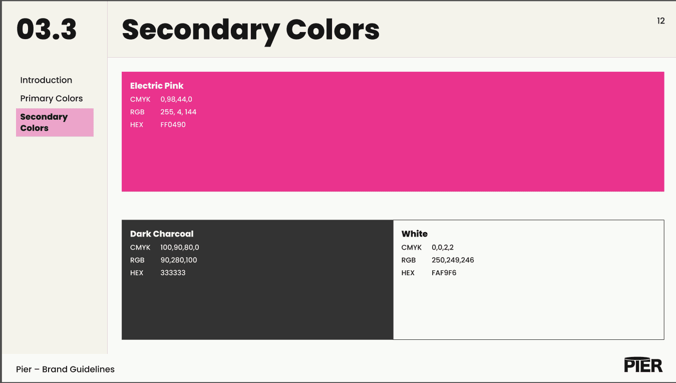
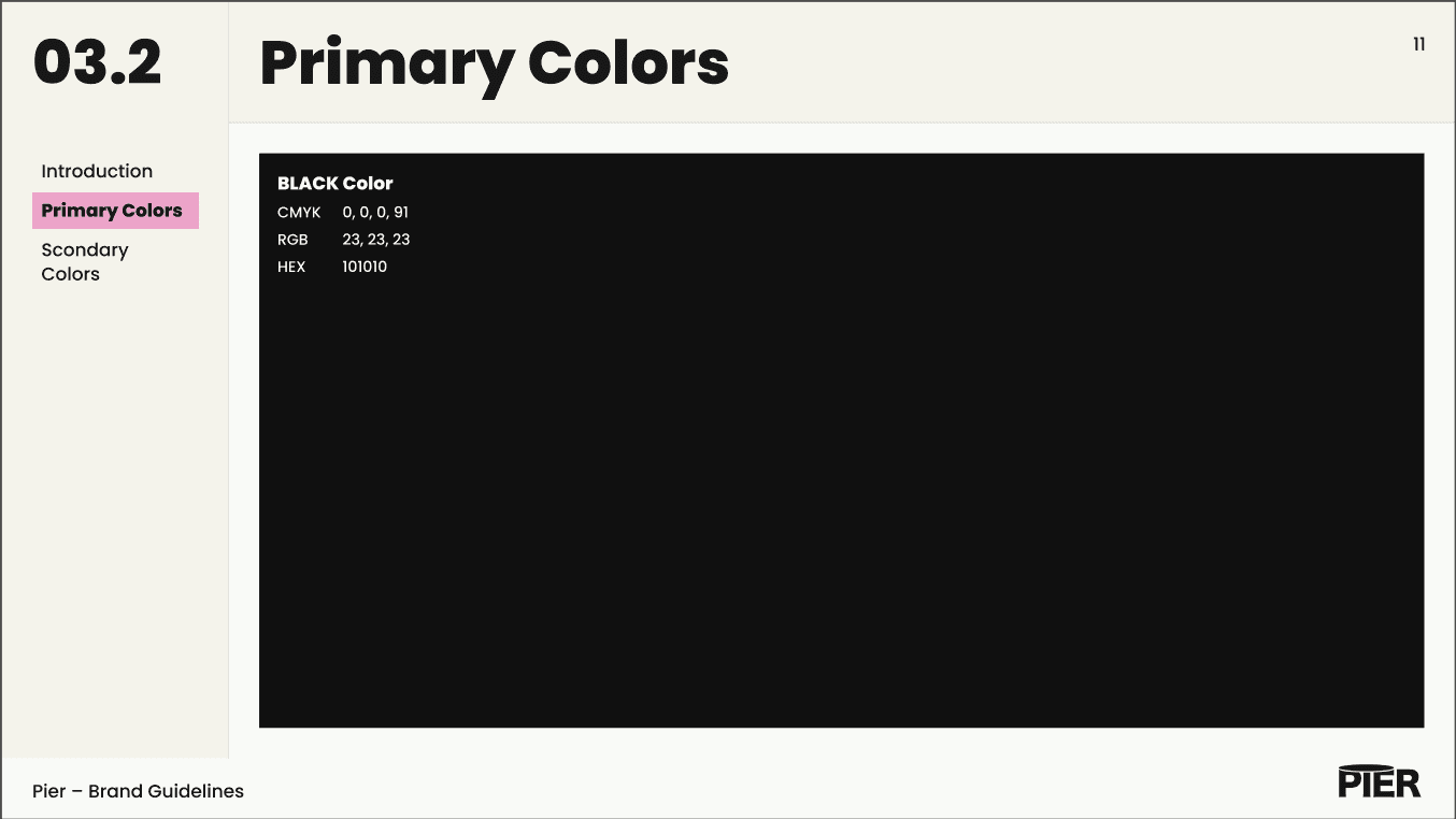
Our color palette reflects our brand's youthful and engaging personality. “Electric Pink” highlights buttons and important information, while we use a softer “Black” for the background to enhance the clubbing vibe without straining users' eyes.
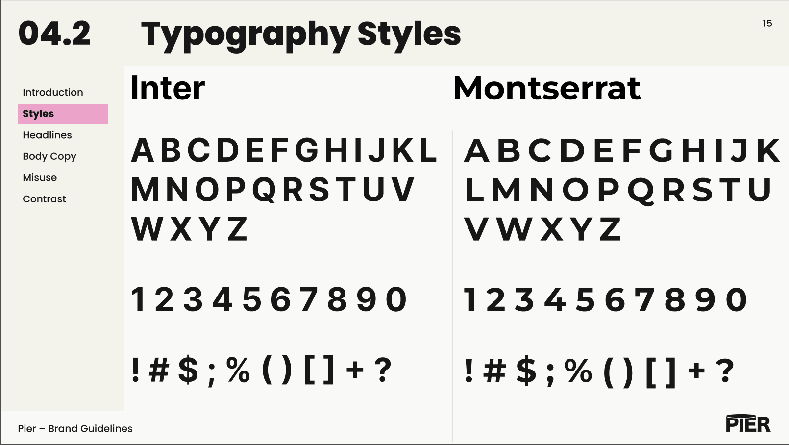
We selected Inter and Montserrat as our main fonts to create a visually appealing and functional typographic system that enhances both user experience and aesthetics.
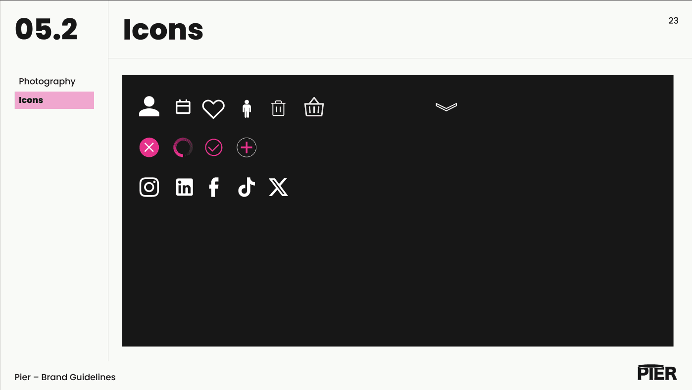
We used a mix of white and pink icons. White icons are placed all over the solution (becoming pink when hovered on). The pink icons are reserved for the process of booking a table. We also have Social Media icons for faster and easier access to other companies' platforms.
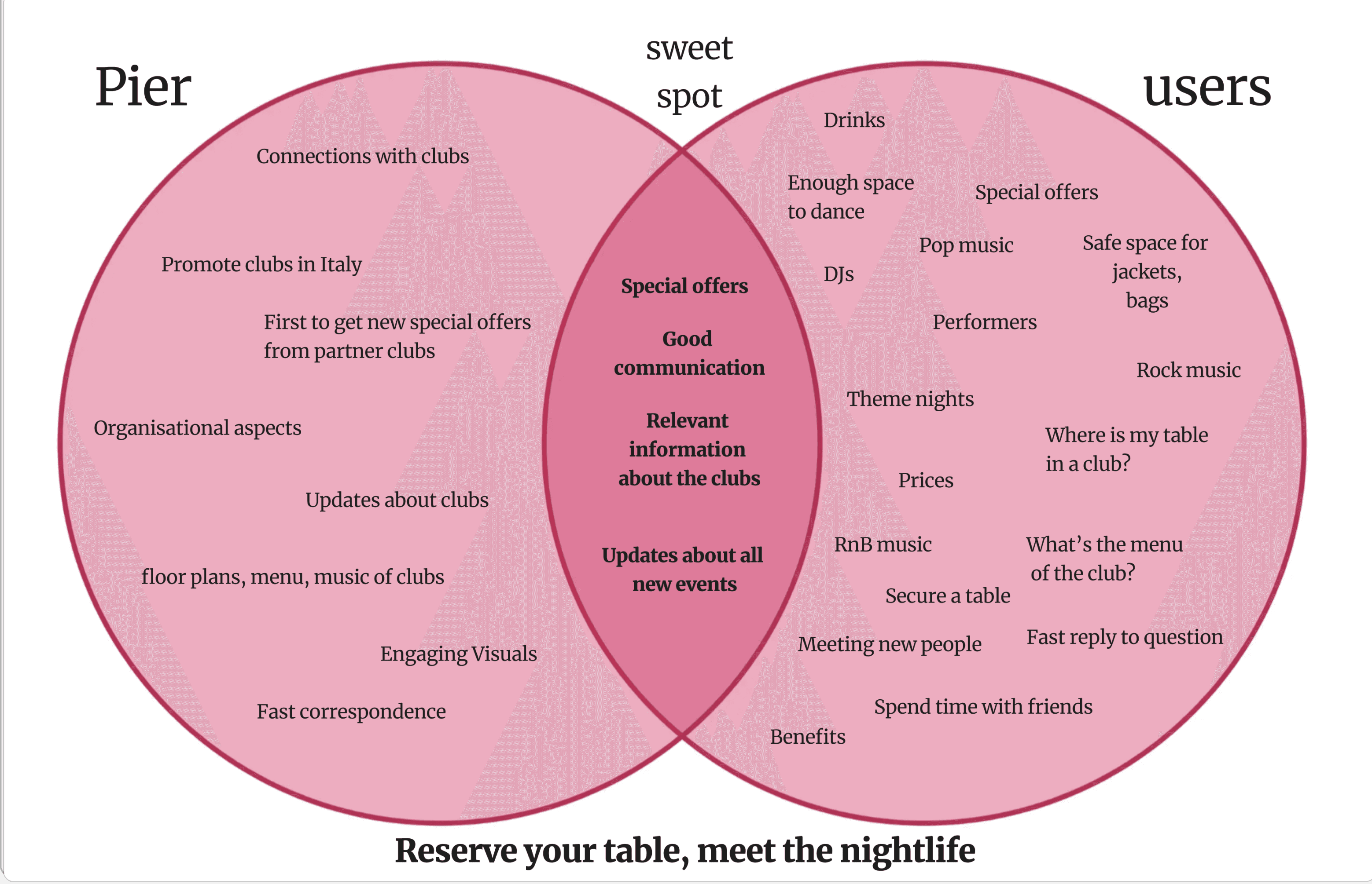
We also defined our Sweet Spot, which represents the ideal balance between user needs and business goals. We visualized this in a diagram, highlighting our focus on creating a user-friendly and visually appealing platform for booking tables in Italian clubs, catering to a vibrant, young, and adventurous audience.
This analysis helped us identify key content tracks for future development:
Information about clubs and events (general info, prices, menus, music)
Details on upcoming events (timeline, location, theme)
A comprehensive timeline of all upcoming events.
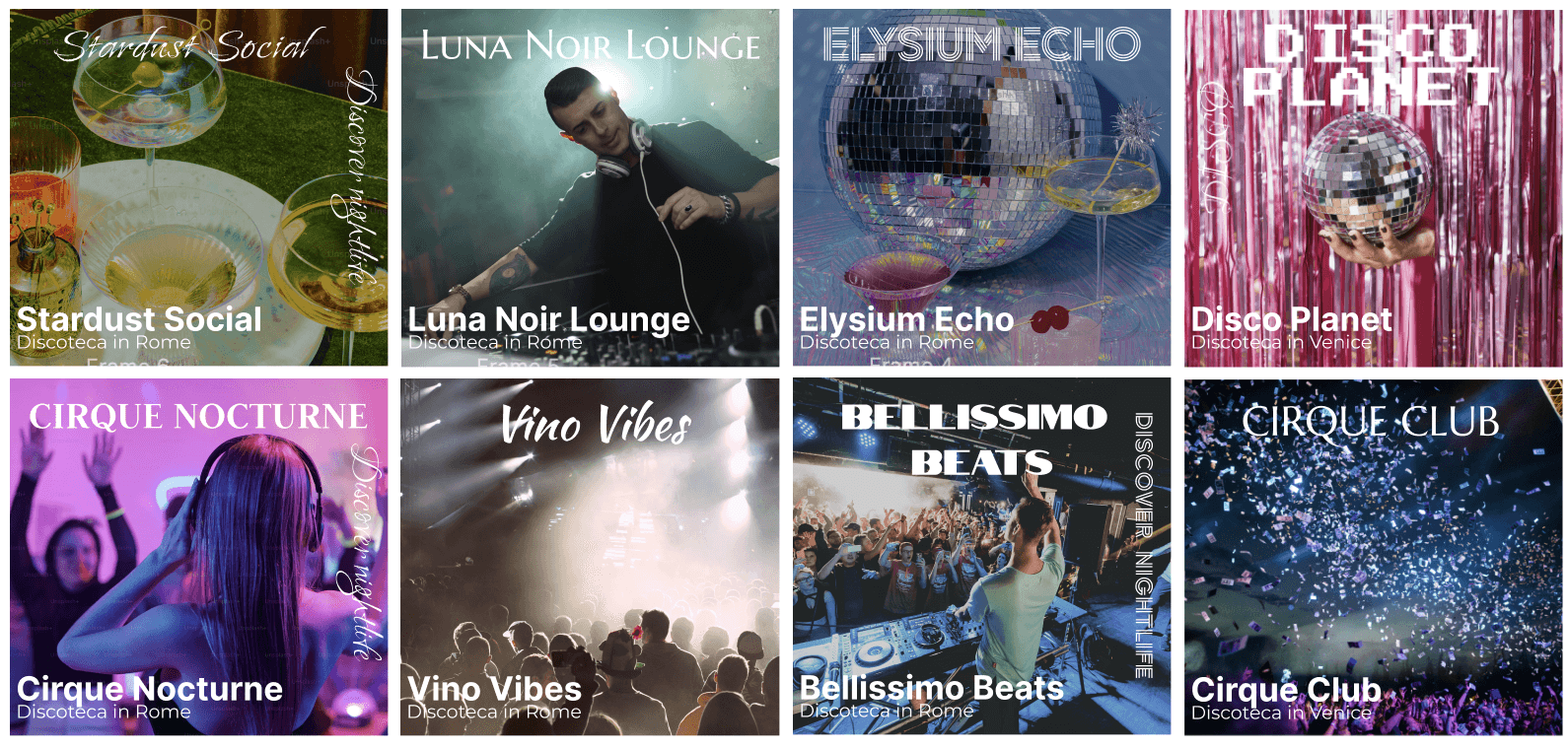
We designed various poster variants for the UI cards across different pages. Recognizing that most content will come from the clubs, we focused on creating a unique poster for each club or event.
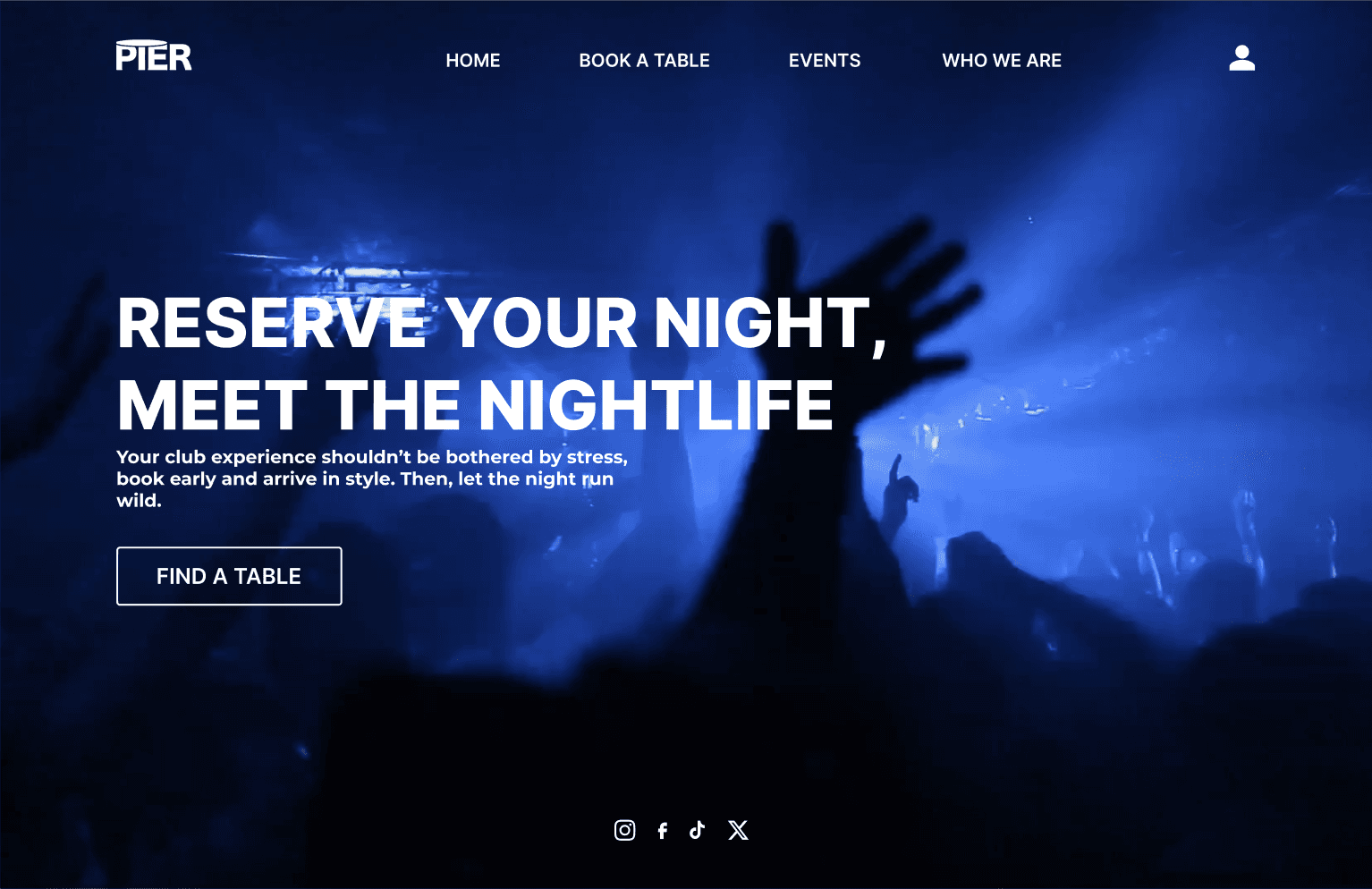
Incorporating feedback from our Lo-Fi testing and following our Design Manual, we created the Hi-Fi prototype. The main goal of the website is to facilitate table bookings at clubs, so we ensured the CTA button is prominent and easily accessible.
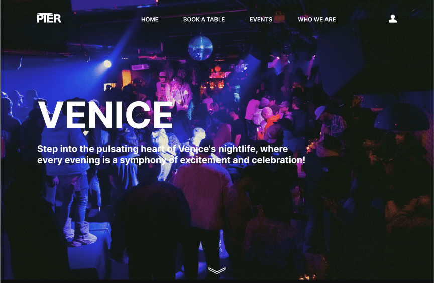
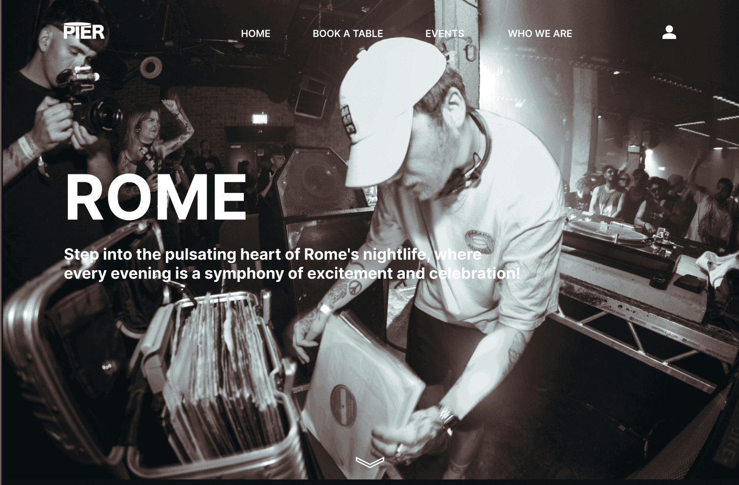
While the video on the homepage may raise accessibility concerns, the client preferred a vibrant, club-like experience. We also created a less intense black-and-white version as an alternative.
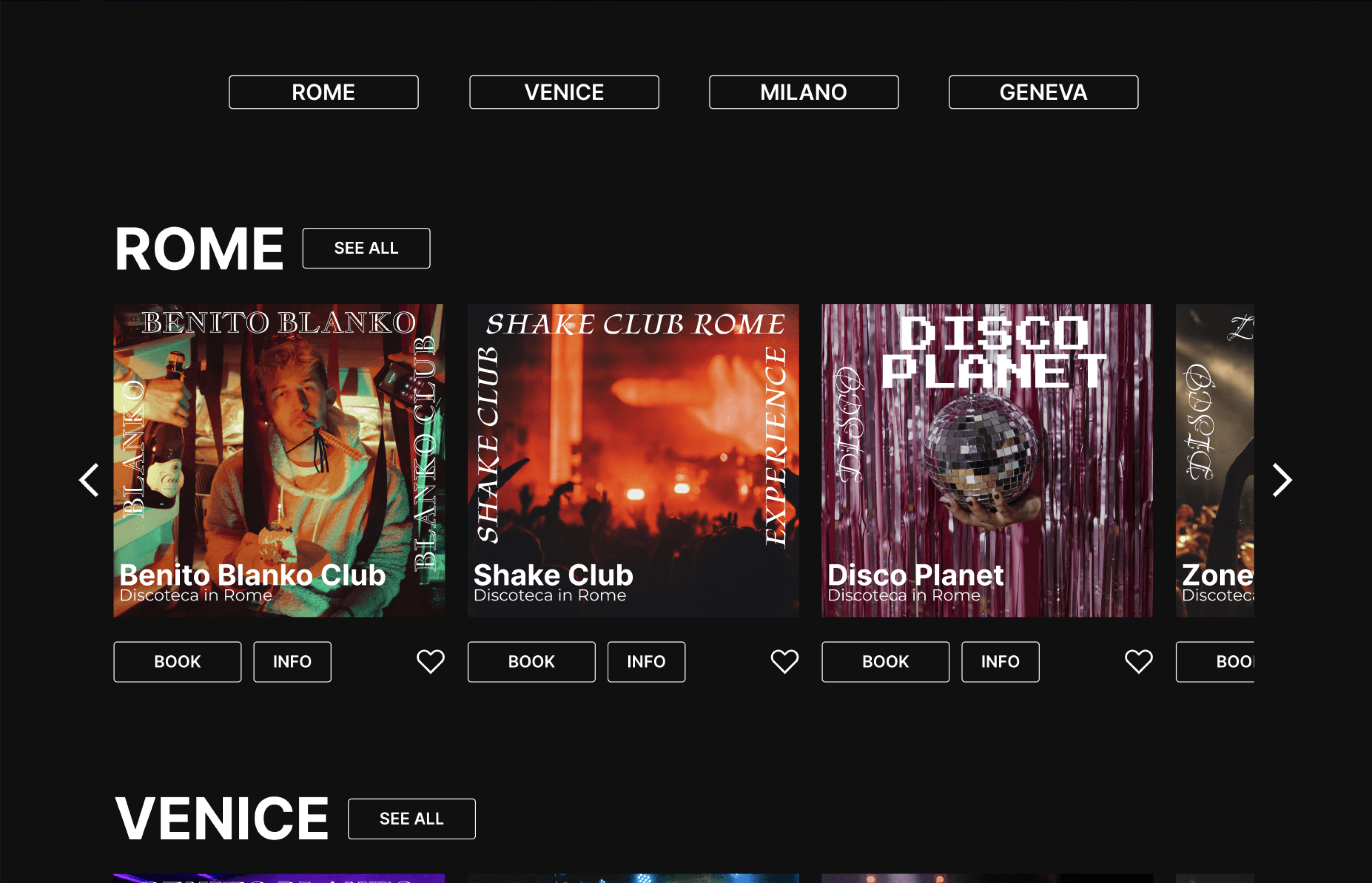
We added city filters at the top for easier navigation and incorporated carousels with UI cards featuring titles. Each card, designed with proximity and hierarchy in mind, showcases a visual poster from the club and includes two CTA buttons, along with a heart icon for saving favorites.
We maintained design consistency across the website, applying the law of proximity on the City page as well. Filters for music type and days of the week were added to help users quickly find parties.
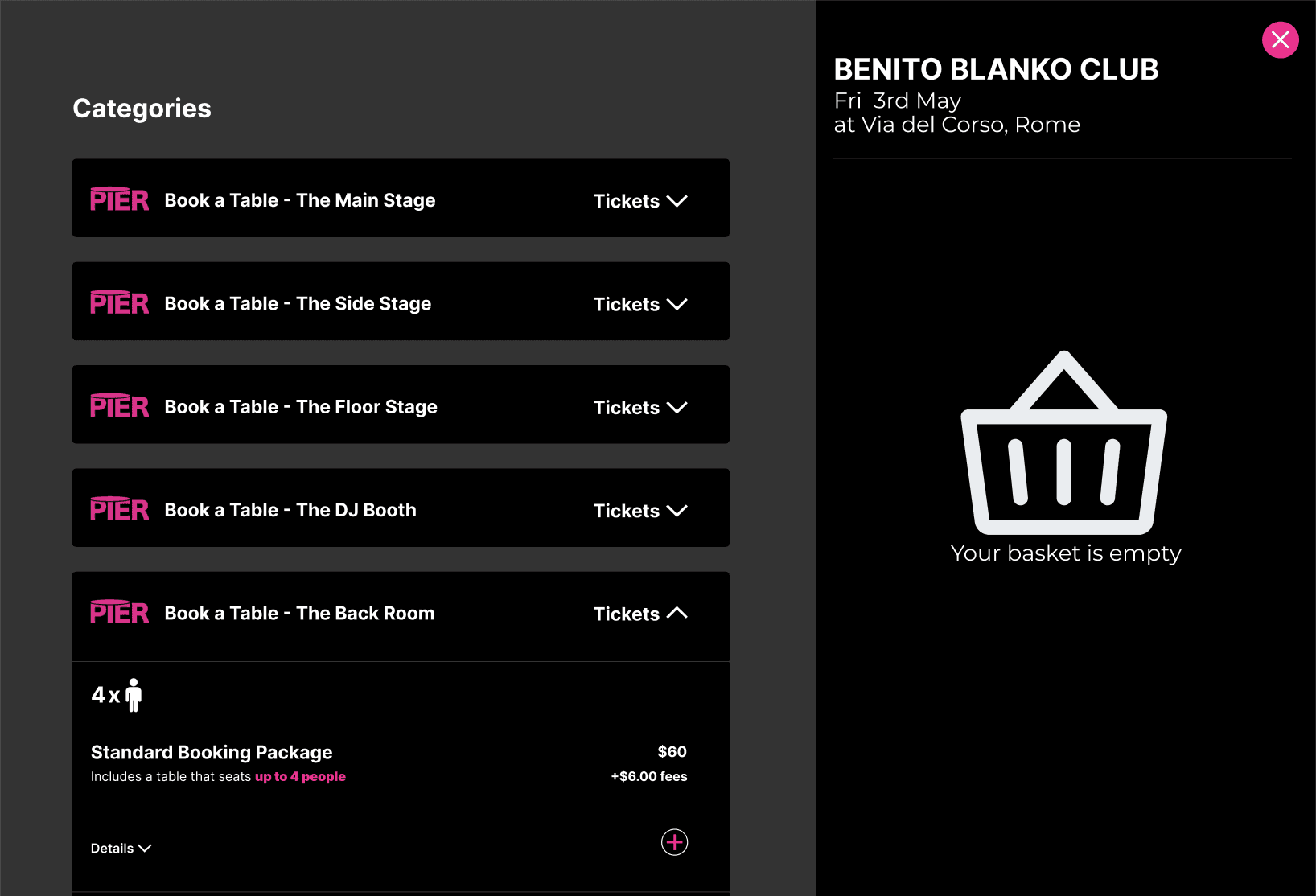
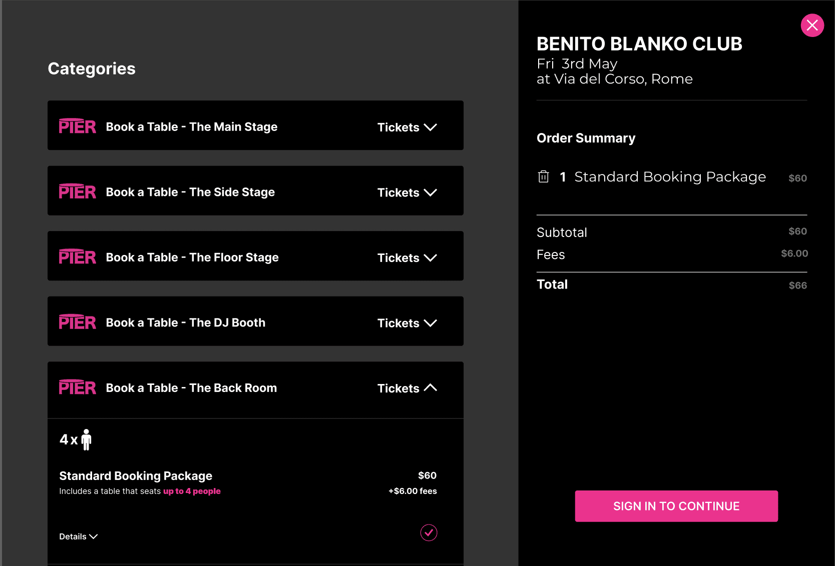
For the Booking Pop-up, we organized categories by club sections, allowing users to easily view packages for different group sizes. We used dual coding—icons and text—to convey key information efficiently.
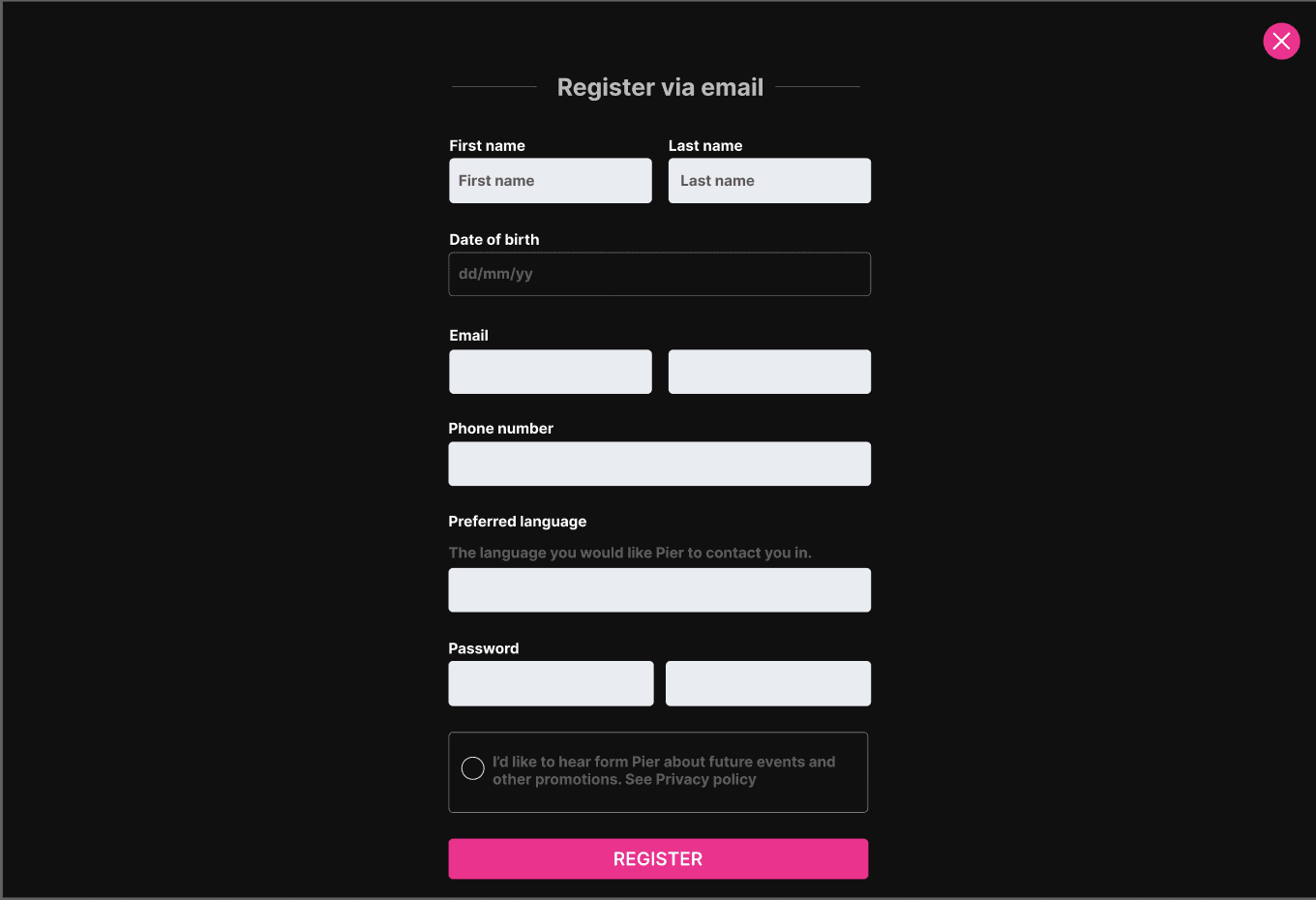
The Register Via Email, Sign In, and Checkout pop-ups followed familiar design patterns for intuitive navigation, ensuring a quicker and smoother user experience.y across the website, applying the law of proximity on the City page as well. Filters for music type and days of the week were added to help users quickly find parties.
We tested with six participants using the Think Aloud Method, along with prepared questions to gather focused feedback. The main concern was with the booking pop-up. Based on the feedback, we decided to change the label from “Tickets” to “Booking” to better align with the user’s intent to reserve a table.
We added an icon and clear specifications for each package to reduce confusion.
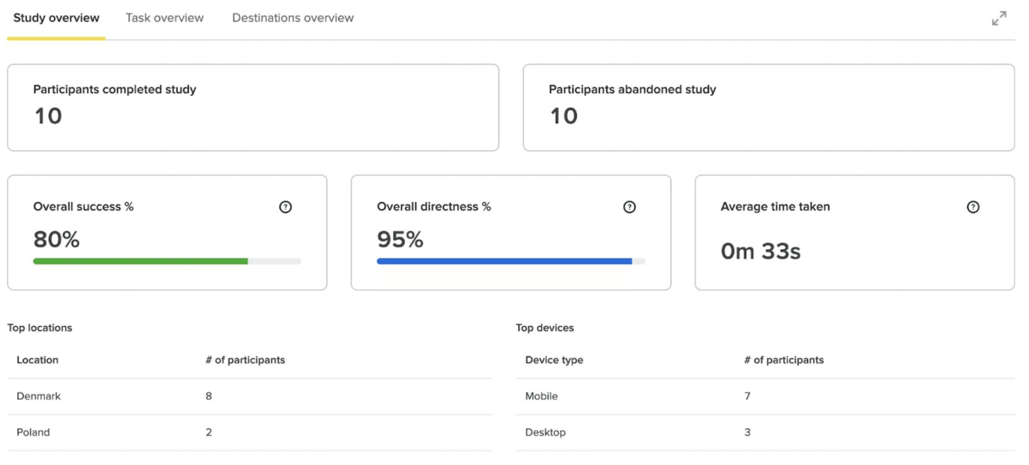
Additionally, we conducted Tree Testing with 10 participants to assess the clarity of our navigation bar, achieving an 80% success rate and a 95% directness rate. This confirmed that users could easily navigate our website.
As we finished with the final design, tested it and implemented the given feedback, we were able to kickstart the development process of our solution - buying a domain and setting up Wordpress
.
We began by selecting the “Inspiro” theme, which offers customizable layouts and integrates well with plugins like WooCommerce and WPForms. This theme is optimized for speed and includes a scroll-detection menu that enhances navigation through visual feedback.
We carefully chose plugins to improve the website's functionality, such as contact forms, SEO tools, and e-commerce features. These additions ensured consistency and helped establish a cohesive brand identity.
Together, the theme and plugins enabled us to create a professional, user-friendly website tailored to Alessandro's needs. We also added some custom CSS, HTML and JavaScript to the Wordpress solution
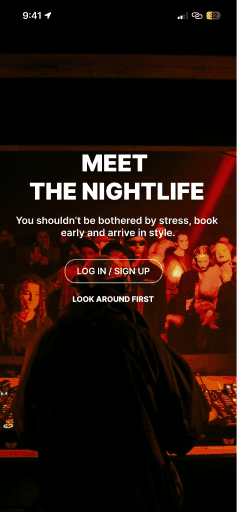
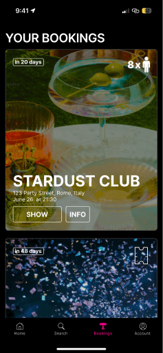
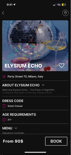
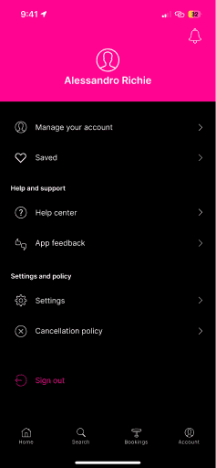
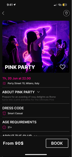
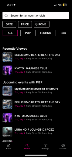
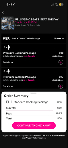
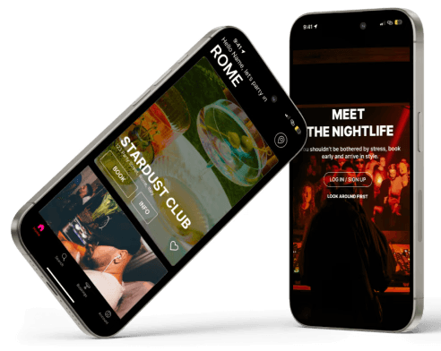
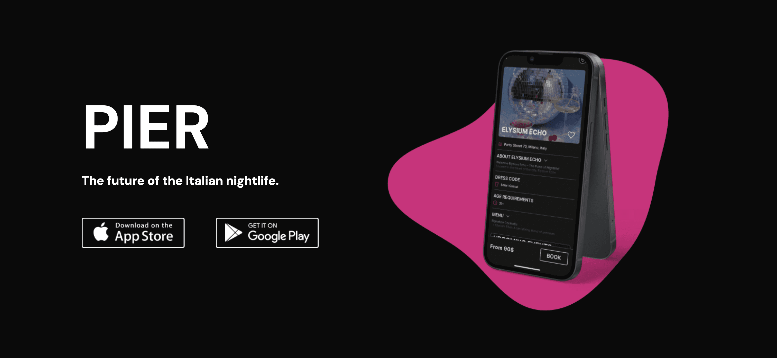
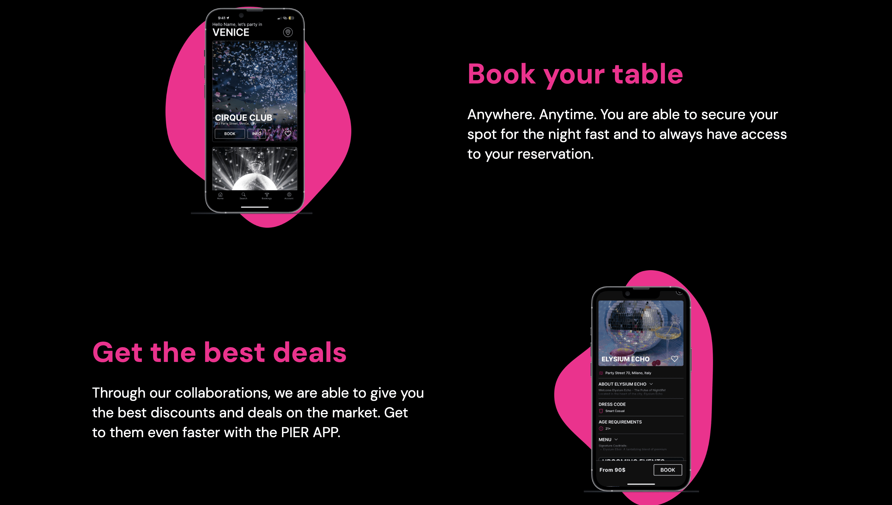
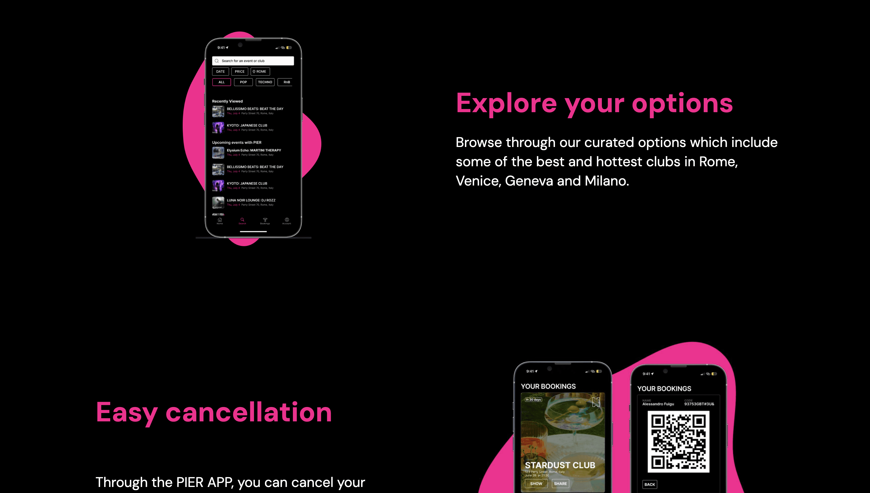
As an improvement to Pier's platform, we also designed a mobile app to help them reach a wider audience. This app enhances accessibility, allowing users to quickly book tables and explore club options on the go. With the app, Pier can cater to both locals and tourists, making the booking process even more seamless and convenient.
Below are the visuals showcasing the app's design and functionality.
